Preview image. Unlock full-res
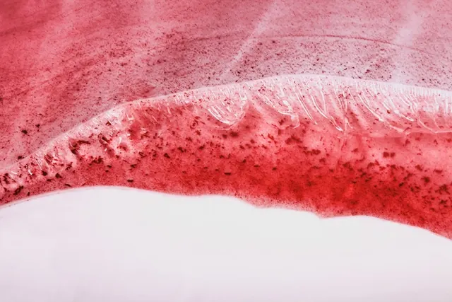
An abstract graphic composition dominated by soft rose-pink tones (71%) with bold crimson-red accents, creating a warm, sophisticated color study.
Summary
An abstract landscape-format composition dominated by soft, warm rose-pink (71%) with bold crimson and deep red accents (17%), creating a warm, sophisticated color palette study.
Visual description
The composition is primarily filled with a soft, warm rose or dusty pink tone, creating a calming, feminine aesthetic. Bold, saturated crimson-red and deeper rose-red elements provide contrast and visual interest, likely as graphic shapes, strokes, or compositional accents. The landscape aspect ratio and abstract approach suggest this could be a color system study, digital art, or graphic design piece. The warm palette is sophisticated without being saccharine.
Key takeaway
The rose-and-crimson combination is warm and energetic while maintaining elegance through tone control. The balance between soft dusty pink and bold true red creates visual sophistication—not overly feminine or decorative, but refined and contemporary. This palette works for brands seeking warmth with contemporary edge.
Reuse notes
Strong for fashion, beauty, or luxury brands with a feminine or warm-focused aesthetic. Excellent for art-forward or design-heavy applications. Works well for editorial design, packaging, or brand identity with contemporary sensibility. The soft rose with crimson accent is particularly suitable for beauty products, wellness, or lifestyle brands. Perfect for social media graphics, web design, or poster design. Consider this palette for apps, interfaces, or digital products emphasizing warmth and sophistication. Versatile for both print and digital applications. Strong for personal brands, creative portfolios, or contemporary art direction.
More like this




Keep what you find
A free account saves references to boards and can send you a weekly email of picks based on what you save.
To see every result, go Pro.