
Preview image. Unlock full-res
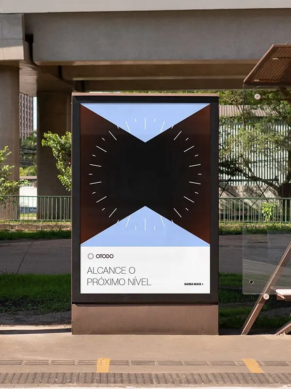
High-contrast duotone composition of pale blue and near-black with minimalist spatial organization.
Summary
A stark duotone composition balancing pale periwinkle-blue and nearly-black with geometric spatial organization suggesting architectural or data visualization.
Visual description
The frame is divided by clear geometric logic: pale blue and deep black/charcoal interact to create a sense of structure and space. The palette is reduced to exactly two colors, creating maximum contrast. The composition suggests architectural elevation, data diagram, or abstract geometric study. Horizontal orientation. No imagery, type, or ornament visible.
Key takeaway
True duotone (two-color) systems force strategic composition. Pale cool tones paired with near-black read as technical and sophisticated. High contrast works for navigation, signage, and structured data presentation.
Reuse notes
Excellent pattern for architectural graphics, technical diagrams, and minimal web backgrounds. The cool blue-and-black pairing is ideal for tech and data-forward brands. Works well with typography and imagery layered over the geometric structure. Test proportions—the current balance suggests careful 50/50 split worth preserving.
More like this





Keep what you find
A free account saves references to boards and can send you a weekly email of picks based on what you save.
To see every result, go Pro.