Preview image. Unlock full-res
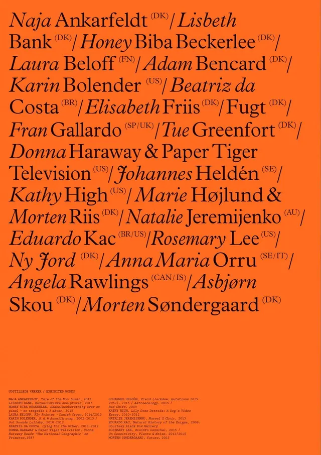
Vibrant orange poster densely set with mixed serif typography listing artist names and exhibition works in Danish.
Summary
A vibrant orange poster page listing artist names and exhibition works in mixed roman and italic serif typefaces, with small-print exhibition details at bottom. Designed as an exhibition credits or program page.
Visual description
Bright burnt-orange background completely filled with dense, overlapping lines of serif typography in black and dark text. Names are set in alternating roman and italic weights, arranged in a flowing, left-aligned block. A mix of full artist names with country/region abbreviations (DK, US, BR, etc.) is interspersed with work titles and venues. Small exhibition information and dates appear in the lower portion in reduced point size. The entire composition is text-driven with no imagery or decorative elements—pure typographic information design.
Key takeaway
Dense typographic layouts can create visual impact through scale, contrast, and the interplay of roman and italic forms. Color saturation on background combined with black type creates hierarchy and readability even at high information density.
Reuse notes
Strong for exhibition catalogs, program pages, artist directories, or cultural institution materials. The warm color suggests openness and creativity. Works especially well for arts, design, and cultural content where listing contributors is important. The typographic hierarchy relies on weight and style shifts rather than size changes.