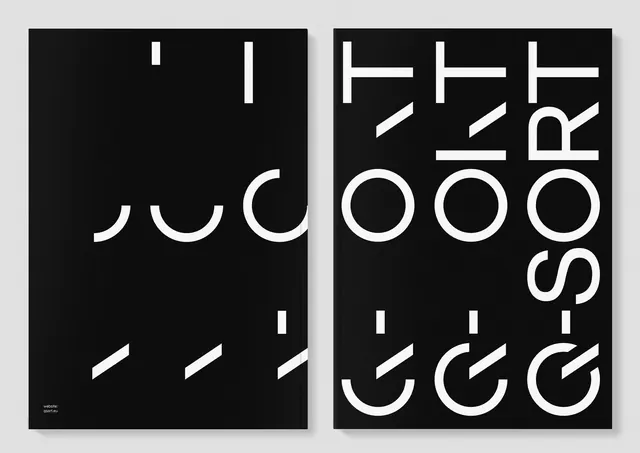
Minimalist black poster featuring layered, rotated typographic forms creating a kinetic composition on white cardstock mockup.
Summary
A striking modernist poster showcasing layered, rotated sans-serif letterforms in black against white, creating visual rhythm through spatial composition rather than color.
Visual description
White cardstock or poster mockup displayed at a slight angle, photographed against a neutral gray background. The poster surface is filled with large black sans-serif typographic elements—individual letters and letterforms—layered and rotated at various angles (approximately 15, 45, and 90 degrees). The letterforms appear to be from different weights of the same sans-serif family, creating tonal variation through stroke weight. The composition is deliberately asymmetric, with heavier visual weight toward the center and lower right. No representational imagery is present; the poster is purely typographic abstraction. The cardstock has subtle shadow and dimension, indicating it is a three-dimensional object (a physical poster or mockup standing upright) rather than a flat graphic.
Key takeaway
Pure typography as composition—by rotating and layering letterforms without legible words, the designer shifts focus to shape, weight distribution, and spatial rhythm. This approach is more about formal visual harmony than message delivery.
Reuse notes
Excellent for design portfolio pieces, agency websites, or poster series exploring typographic abstraction. The monochrome palette ensures it works at any scale and prints efficiently. Effective in interior design contexts (offices, studios, design schools) where visual sophistication is valued. The rotation technique helps break monotony when using a single typeface. Caution: legibility as a poster for public information would be poor; reserve for contexts where the viewer will stand and study the formal composition (gallery, design space, featured layout rather than wayfinding).
More like this




Keep what you find
A free account saves references to boards and can send you a weekly email of picks based on what you save.
To see every result, go Pro.