Preview image. Unlock full-res
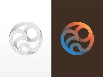
Logo design showing two variations of a concentric circular form: left is a minimal grayscale line study, right is the colored version with gradient blue-to-orange blend.
Summary
A logo concept rendered two ways: left shows a minimal line-drawn approach with nested circles in grayscale; right shows the same circular form filled with a warm blue-to-orange radial gradient.
Visual description
The composition divides into two equal halves. Left side features overlapping concentric circles in thin black lines on white, creating depth through layering and negative space. Right side presents the identical circular structure filled: innermost to outermost segments blend from warm orange through coral to cool slate blue, creating a radial gradient that moves through the color wheel. Both versions sit on neutral backgrounds—left on white, right on dark brown.
Key takeaway
Showing a logo in both monochrome and color versions proves versatility and demonstrates the underlying structure. The gradient adds vibrancy and modernity while the line version conveys clarity and sophistication.
Reuse notes
Strong approach for tech, creative, or forward-thinking brands. The concentric circles suggest growth, cycles, or target-focused positioning. The gradient version works for digital; the line version for embossing, etching, or single-color applications. The dark brown background on the right is unusual—may indicate a secondary color in the brand palette. Test both versions against intended applications (business cards, web, signage) before finalizing.
More like this

Keep what you find
A free account saves references to boards and can send you a weekly email of picks based on what you save.
To see every result, go Pro.