Preview image. Unlock full-res
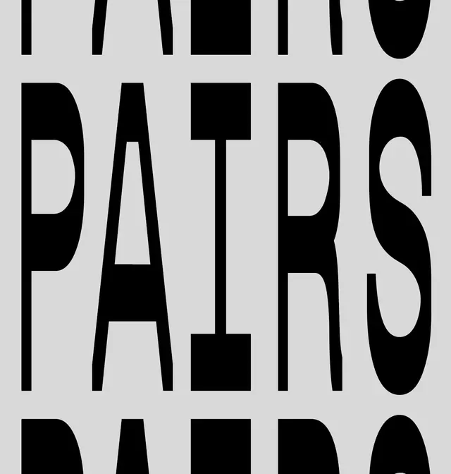
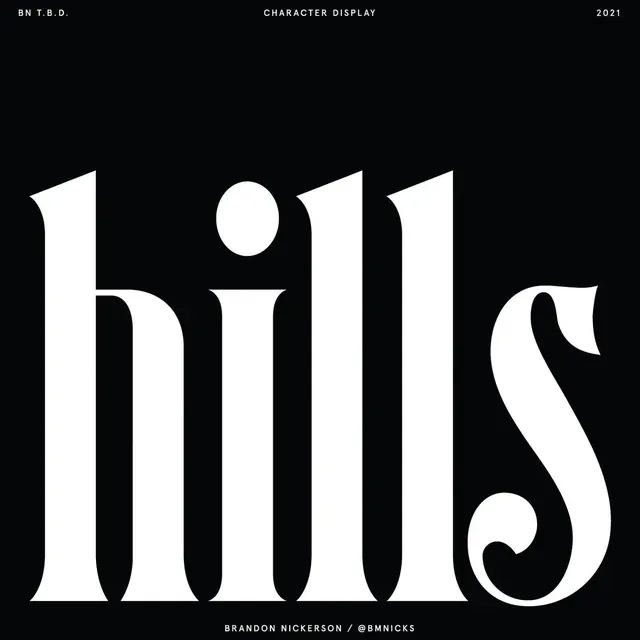
Large-scale black display typography reading "PAIRS" in a geometric sans-serif with distinctive rounded terminals and clean letterforms.
Summary
A bold geometric display typeface showcasing large black letterforms spelling "PAIRS" against a light gray background, emphasizing clean character construction and distinctive rounded terminals.
Visual description
The typography is set in a heavy-weight geometric sans-serif with pronounced curves at terminal points. Each letter features subtle curves that prevent the design from feeling purely mechanical—notable in the rounded edges of the P, A, I, R, and S characters. The generous scale (approximately 50% of the composition) allows the viewer to appreciate fine details like the counter shapes and stroke consistency. The monochromatic color scheme (pure black on light gray) maximizes readability and showcases the letterforms' inherent structure.
Key takeaway
The balance between geometric precision and subtle humanizing curves creates a typeface that's both technical and approachable. The display scale demonstrates how careful letterform design maintains character and distinction at any size.
Reuse notes
Strong reference for geometric display type design. Works well for headlines, brand identities, and poster applications. The rounded terminals prevent coldness while maintaining clarity—ideal for brands seeking a modern yet approachable aesthetic. Test at smaller sizes to ensure legibility.
More like this


Keep what you find
A free account saves references to boards and can send you a weekly email of picks based on what you save.
To see every result, go Pro.