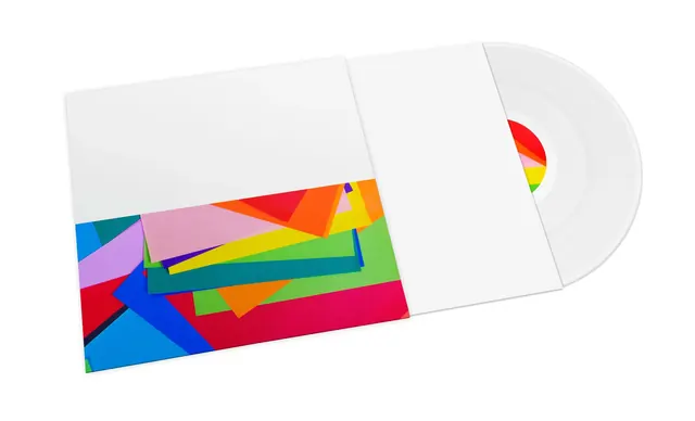
Preview image. Unlock full-res
A horizontal layout showcasing a vibrant four-color palette with light cream background, teal blue, deep red, and yellow-gold accents arranged in organized sections.
Summary
A color study showcasing a vibrant four-color palette in organized horizontal sections: cream background with teal blue, crimson red, and mustard yellow accents creating a balanced, energetic composition.
Visual description
The layout presents a carefully balanced four-color palette: light cream-white (60.6%) dominating as neutral background, teal-blue (25.1%) providing cool contrast, vibrant red (11.5%) adding pop, and golden-yellow (2.8%) as accent. The geometric sectioning of colors suggests a systematic approach to color organization, likely for design system or color palette documentation.
Key takeaway
This palette demonstrates how to combine cool (teal) and warm (red, gold) accents within a light neutral background without creating visual chaos. The proportion and systematic presentation make it an excellent reference for color documentation and playful yet organized design systems.
Reuse notes
Perfect palette reference for brands seeking colorful yet organized aesthetics. Works well for education, children's products, or brands wanting energy without chaos. The teal-red combination provides strong contrast suitable for icons or call-to-action elements. The cream background provides breathing room in multicolor compositions.
More like this





Keep what you find
A free account saves references to boards and can send you a weekly email of picks based on what you save.
To see every result, go Pro.