Preview image. Unlock full-res
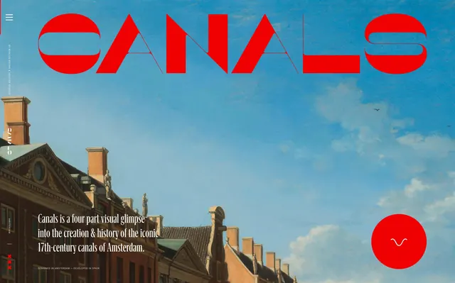
A website hero pairing a bold red display wordmark "CANALS" with a painterly, cloud-filled sky photograph of Amsterdam rooftops.
Summary
The hero section of a documentary microsite about Amsterdam's canals, combining a geometric red display wordmark with a cloudy blue-sky photograph of historic rooftops.
Visual description
A large custom sans-serif wordmark "CANALS" spans the full width of the frame in bold red type with distinctive geometric letterforms (the A rendered as a circle-cut shape), overlaid directly on a photograph of a pale blue sky filled with soft white clouds above a row of ornate Dutch gable rooftops. Below the wordmark, two lines of white serif body copy describe the project as "a four part visual glimpse into the creation & history of the iconic 17th-century canals of Amsterdam." A small red circular icon with a wave-like glyph sits in the lower right, and a thin vertical navigation label runs along the left edge.
Key takeaway
Overlaying a saturated, geometric wordmark directly onto a soft, painterly photograph creates strong contrast between graphic boldness and photographic subtlety, letting the type carry the branding while the image sets the historical mood.
Reuse notes
Strong reference for editorial or documentary-style website heroes that need to pair a distinctive custom wordmark with atmospheric photography. The red-on-sky-blue combination is a striking but color-specific choice; the layout logic (huge type over a horizon-line photo) generalizes well to other city or travel storytelling sites.
More like this


Keep what you find
A free account saves references to boards and can send you a weekly email of picks based on what you save.
To see every result, go Pro.