
Preview image. Unlock full-res
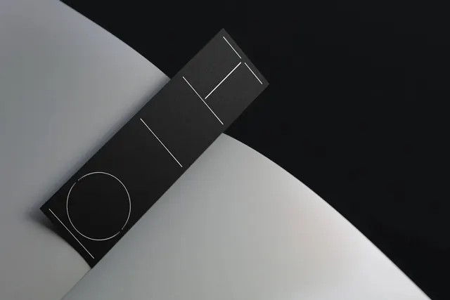
Minimalist abstract composition in pure grayscale tones, exploring value and contrast across five shades from near-black to near-white, creating subtle geometric abstraction through tone alone.
Summary
A pure grayscale abstraction exploiting five distinct value levels from nearly black to nearly white, creating subtle geometric form and visual interest through contrast and tonal relationships alone, without color.
Visual description
Nearly-square portrait composition (683x1024) using a restricted palette of five grayscale values: deep charcoal (#292929), medium-dark gray (#858585), medium gray (#A6A6A6), warm medium gray (#9C9C9C), and near-white (#E6E6E6). The composition appears geometric, suggesting abstract forms created entirely through tonal shifts. The range demonstrates sophisticated understanding of value and contrast as design tools independent of color, creating visual depth and hierarchy through gray alone.
Key takeaway
The power of value (lightness/darkness) as a design tool distinct from color. A restricted grayscale palette can create compelling abstraction, contrast, and visual interest. Tonal relationships alone can define form and create rhythm, relevant to digital design, accessibility, and timeless aesthetics.
Reuse notes
Strong reference for accessible design, grayscale reproduction, and print design that must work in monochrome. The value range is ideal for type hierarchy, interface contrast studies, and ensuring designs remain clear in any color environment. Excellent inspiration for architects, product designers, and any discipline working with form and light. The geometric approach works well for pattern design, abstract branding, and conceptual work. Essential for understanding visual hierarchy beyond color.
More like this

Keep what you find
A free account saves references to boards and can send you a weekly email of picks based on what you save.
To see every result, go Pro.