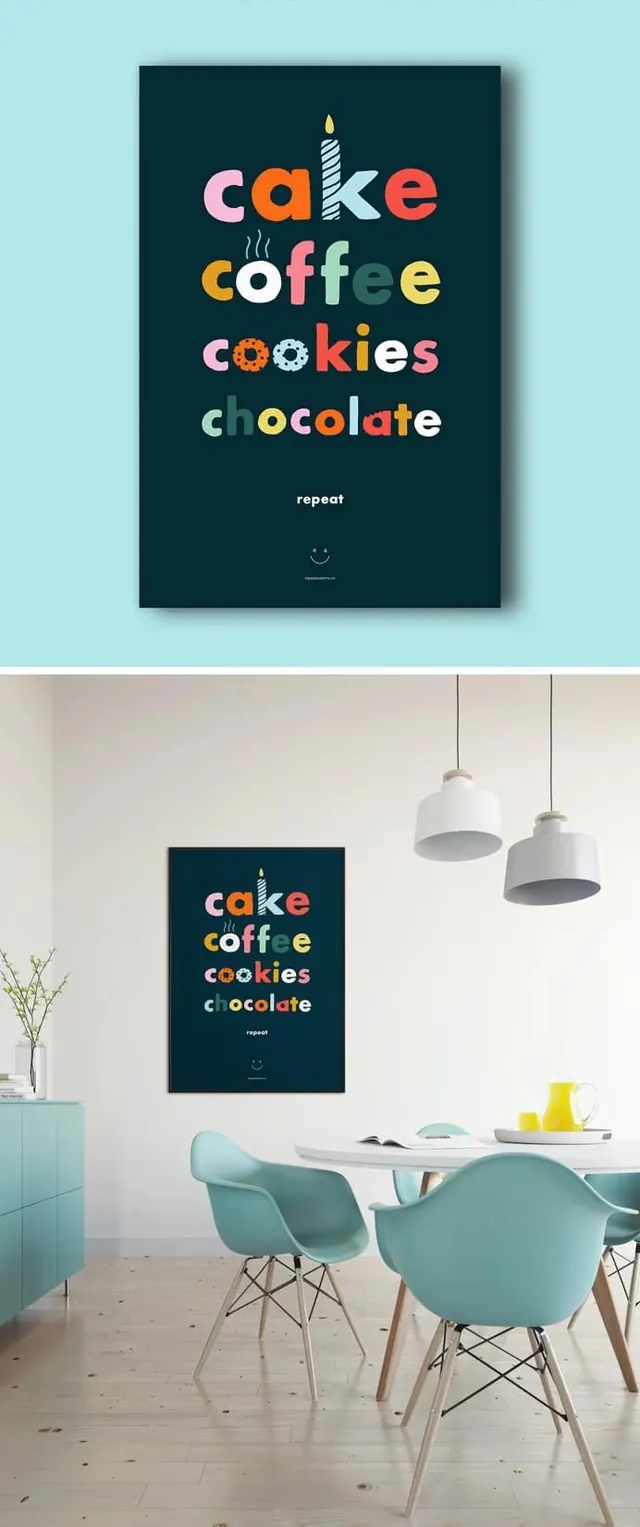
Preview image. Unlock full-res
Vertical color study or design composition balancing cool blue-greens, warm rust-orange, and deep teal tones, demonstrating natural earth-tone palette harmony in a portrait-oriented format.
Summary
A narrow vertical color study balancing cool muted blue-greens and soft sage with warm rust-orange tones and deep teal accents, demonstrating sophisticated natural palette harmony and proportion.
Visual description
Tall, narrow portrait composition (692x1651) built on a four-color palette: soft blue-gray (#C2D1CE), deep dark teal (#0B2E36), warm rust-orange (#A65642), and muted blue-green (#6A9191). The arrangement suggests careful proportion and balance, with the cool tones anchoring the warm, creating visual equilibrium. The palette feels natural and organic despite being highly curated, reminiscent of landscape or materials-inspired color theory.
Key takeaway
The elegance of mixing warm and cool earth tones in equal proportion without one dominating. The unexpected pairing of rust with muted blue-greens creates visual interest while remaining calming. The narrow vertical format emphasizes proportion and rhythm.
Reuse notes
Strong reference for natural, organic brand palettes and interior design color schemes. Works well for wellness, architecture, fashion, and sustainable brands. The color combination is ideal for packaging, editorial, and brand identity systems seeking natural, earthy aesthetics with contemporary sophistication. The vertical narrow format is particularly effective for social media, mobile interfaces, and banner designs. Excellent for mood boards exploring natural color harmonies.
More like this
Keep what you find
A free account saves references to boards and can send you a weekly email of picks based on what you save.
To see every result, go Pro.