Preview image. Unlock full-res
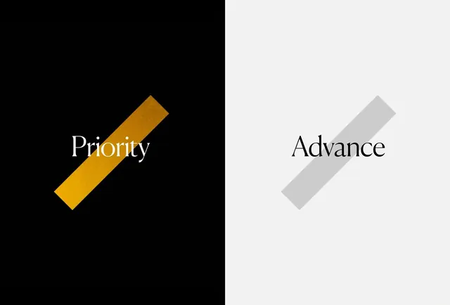
High-contrast promotional or theatrical design with bold sans-serif type on a split dark-light background, featuring geometric slash shapes as visual punctuation.
Summary
A bold typographic composition split vertically into dark and light halves, with words "Priority" and "Advance" framed by large geometric slash shapes rendered in gold and grey.
Visual description
The frame is divided vertically in half: the left side is pure black, the right side is light grey. On the left, the word "Priority" is set in large, elegant sans-serif type in white, accompanied by a gold diagonal slash shape rotated 45 degrees. On the right, the word "Advance" appears in matching dark type, paired with a grey version of the same slash. The geometric shapes are substantial and act as primary design elements, not mere decoration. The overall effect is rigorous, symmetrical, and theatrical.
Key takeaway
Symmetrical split layouts with mirrored geometric elements create powerful visual balance; colour variation (gold vs grey) adds hierarchy while maintaining structural integrity.
Reuse notes
Ideal for theatrical design, institutional identity, or high-impact promotional materials. The split-screen approach works well for comparative messaging (before/after, two options, complementary concepts). The clean geometry and type pairing suit elegant, premium contexts. Scalable from print to large-format display.
More like this


Keep what you find
A free account saves references to boards and can send you a weekly email of picks based on what you save.
To see every result, go Pro.