Preview image. Unlock full-res
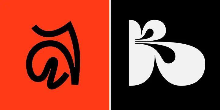
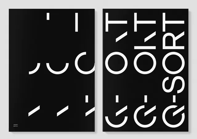
A split-screen composition showing two abstract letter forms or monogram designs rendered in bold black and white with high contrast.
Summary
A split composition featuring two abstract typographic designs rendered in bold geometric forms, one on bright red background and one on black.
Visual description
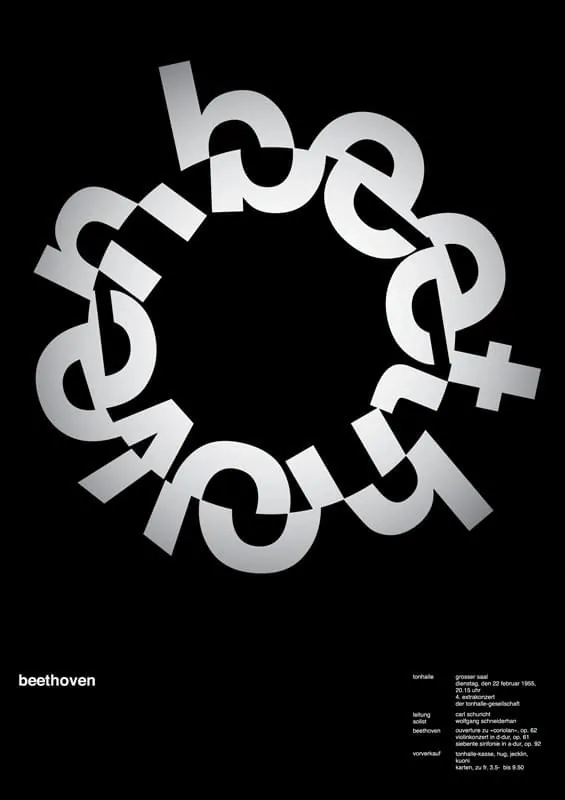
A divided canvas shows two distinct letterform interpretations. On the left, a bold black curved abstract form sits on a bright red-orange background. On the right, an inverted white form occupies a black background. Both designs use clean geometric construction with flowing curves and are displayed at large, commanding scale. The symmetrical split-screen layout creates strong visual balance.
Key takeaway
Bold geometric letterforms with high contrast create memorable logo and type treatments. The color blocking and symmetrical composition maximize visual impact.
Reuse notes
Works for logo design projects, type specimen references, or design systems exploration. Ideal for brands needing bold, geometric, or playful typographic identities.
More like this

Keep what you find
A free account saves references to boards and can send you a weekly email of picks based on what you save.
To see every result, go Pro.