Preview image. Unlock full-res
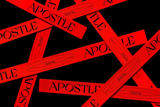
Bold graphic design featuring the word "APOSTLE" repeated across bright red caution tape patterns, conveying edgy, rebellious branding for a digital agency.
Summary
A bold branding composition featuring the word "APOSTLE DIGITAL" repeated across bright red caution-tape style bands, creating a striking graphic pattern that conveys agency identity.
Visual description
Geometric pattern composition with multiple bright red diagonal bands containing black sans-serif condensed typography reading "APOSTLE", "DIGITAL", and descriptive text scattered across the frame. The red bands overlap and extend across a black background, mimicking the appearance of industrial caution or warning tape. Small hand-drawn line marks accent each text element. The composition fills the entire frame with no white space, creating maximum visual impact. The typography is bold, all-caps, and appears to flex and follow the angle of each red band. The overall effect is energetic and somewhat chaotic while maintaining clear brand messaging.
Key takeaway
Using industrial tape aesthetic and bold graphic treatment to position a brand as edgy, current, and design-forward. The repeating pattern and high contrast create immediate visual recognition.
Reuse notes
Excellent for creative agencies, digital design studios, and brands seeking to communicate innovation and disruption. The caution-tape approach suggests breaking rules and pushing boundaries. Works well for campaign graphics, social media, and collateral materials. The pattern can be adapted to other color schemes while maintaining the bold aesthetic.
More like this



Keep what you find
A free account saves references to boards and can send you a weekly email of picks based on what you save.
To see every result, go Pro.