
Preview image. Unlock full-res
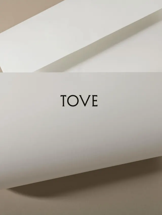
A minimalist inspiration reference featuring neutral tones and refined composition with subtle typography details.
Summary
A minimalist editorial composition featuring refined typography and a carefully balanced neutral color palette of warm grays and browns with subtle serif typeface.
Visual description
The image showcases a clean, editorial layout with elegant serif typography as the focal point. Warm neutral tones dominate—light grays, warm browns, and muted earth tones create a sophisticated, cohesive palette. The composition employs generous whitespace and refined typography hierarchy to establish a calm, contemplative mood typical of high-end editorial design.
Key takeaway
The power of restraint: using a monochromatic warm-neutral palette with carefully selected typography can create a sophisticated, memorable design. The generous spacing and single focal point create visual clarity and elegance.
Reuse notes
Excellent reference for editorial design, luxury branding, and minimal typography systems. Works well for upscale print design, book covers, and high-end publishing. The warm neutral palette translates across print and digital media.
More like this






Keep what you find
A free account saves references to boards and can send you a weekly email of picks based on what you save.
To see every result, go Pro.