Preview image. Unlock full-res
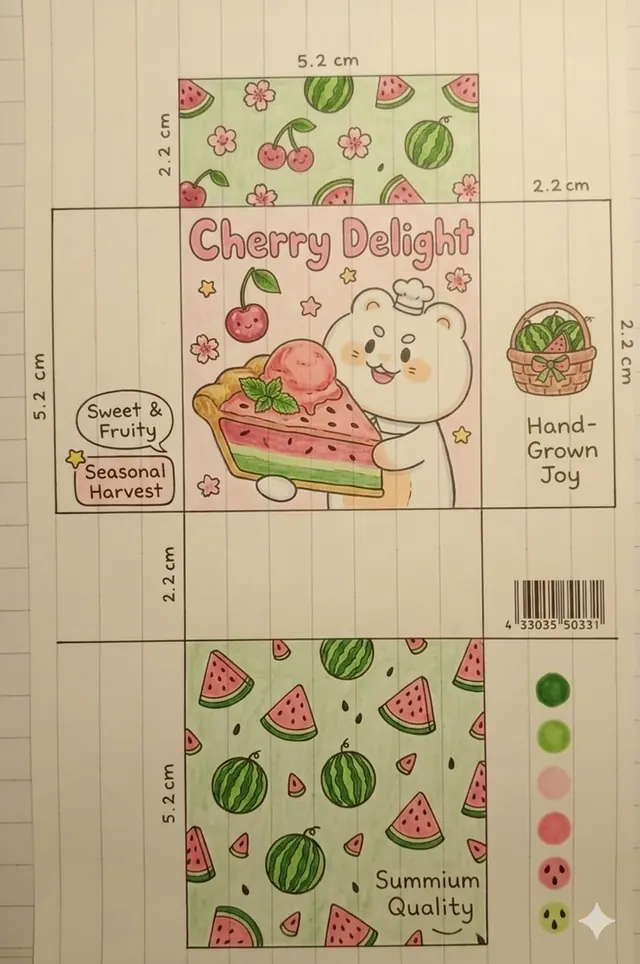
A product packaging dieline presented on grid paper, illustrated in a Japanese kawaii style with a round bear mascot, watermelon and cherry motifs, and pastel mint and pink spot-color accents.
Summary
A packaging dieline spread across grid paper, illustrated in kawaii style: a round white bear hugging a cherry pie anchors the front panel, surrounded by watermelon slices and cherry scatter patterns, with dimension annotations and a spot-color swatch strip.
Visual description
The flat-lay shows a box dieline unfolded on pale grid paper with blue guide lines visible throughout. The main front panel features a large round bear character in a chef hat, drawn with thick outline and minimal shading, hugging a wide slice of pie decorated with cherries and whipped cream. The headline "Cherry Delight" is set in a rounded, slightly hand-lettered sans-serif. Surrounding the main panel are smaller face panels tiled with repeating watermelon-slice and cherry patterns, each on a soft mint green ground. Dimension callouts in centimeters label the panels (e.g. "5.2 cm", "2.2 cm"). A vertical strip of five circular color swatches runs along the right edge in muted green, pastel pink, and cream tones. Small text blocks read "Sweet and Fruity," "Seasonal Harvest," "Hand-Grown Joy," and "Summium Quality" in a relaxed rounded sans-serif. Line weight is consistent and thin throughout; fill colors are flat with no shadow or texture.
Key takeaway
The dieline-as-illustration approach: presenting packaging design spread open reveals the repeat-pattern relationship between panels, which is more instructive than a 3D mockup. The grid-paper backdrop signals "design process" and adds warmth without competing with the illustration. Anchoring the hero panel with a single mascot character holding the product creates immediate brand identity with minimal elements.
Reuse notes
Directly useful as a reference for kawaii food packaging, children's product design, or any seasonal confectionery brand needing a mascot-led system. The spot-color-swatch sidebar is a clean way to show palette approval. The style translates well to stickers, tote bags, and tissue paper. Avoid if the brand voice is premium or adult-oriented.
More like this






Keep what you find
A free account saves references to boards and can send you a weekly email of picks based on what you save.
To see every result, go Pro.