Preview image. Unlock full-res
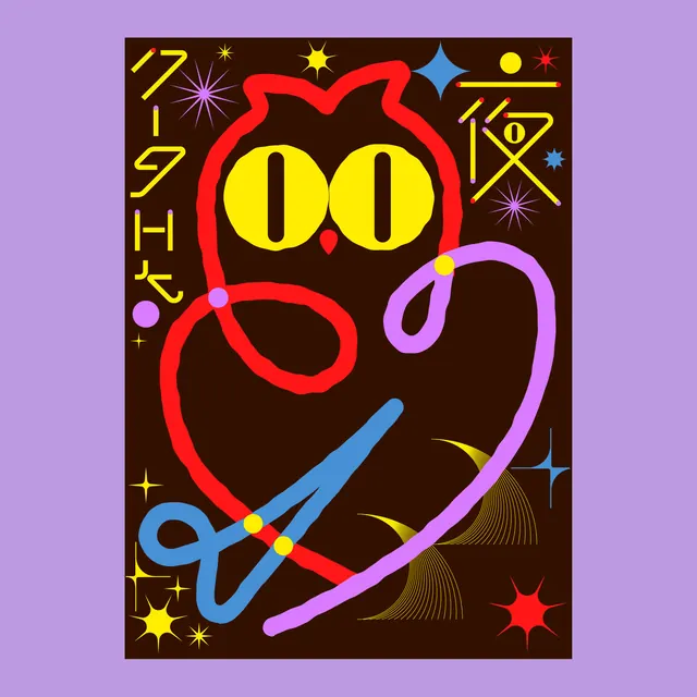
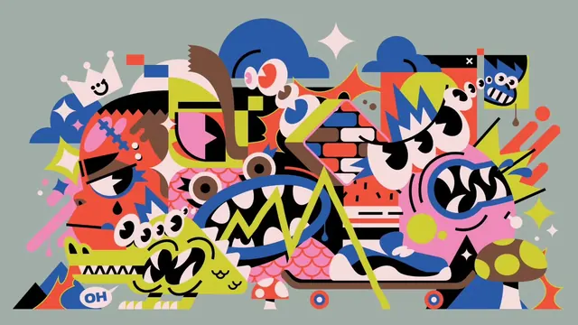
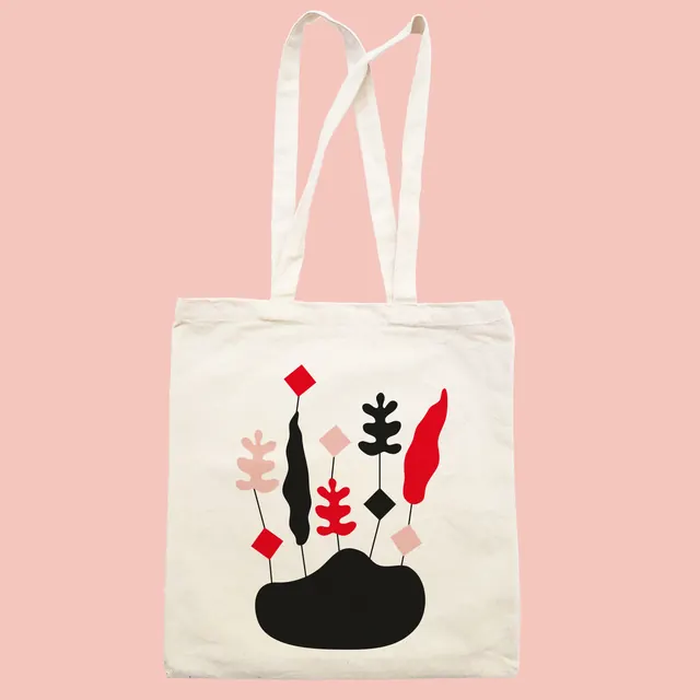
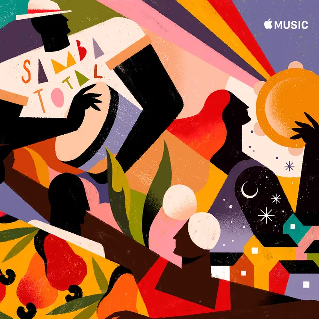
A three-image carousel of colorful graphic illustrations featuring stylized owl characters with bold primary colors, wavy and geometric patterns, set within contrasting background colors.

Summary
Three playful graphic compositions, each featuring a stylized owl character with bold primary-colored outlines, geometric features, and surrounded by abstract shapes, symbols, and text fragments in a pop-art inspired arrangement.
Visual description
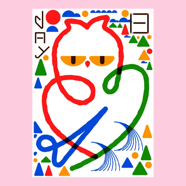
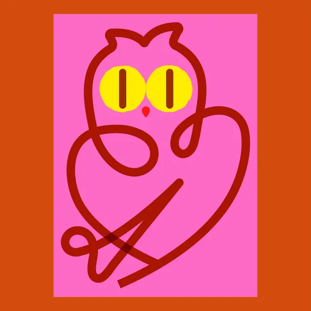
Frame 1 (brown background): An owl face with red outline, yellow circle eyes with dark centers, red teardrop nose, all centered. Surrounding it are wavy curved lines in blue, red, and purple, plus stars, dots, and geometric marks scattered around. Text fragments visible in yellow, black, and other colors. Frame 2 (white background): A similar owl character with red outline, yellow eyes, centered white circle as base. Around it: geometric shapes (triangles in red, blue, green, orange), curved lines (blue, brushy pattern), dots, and connected abstract marks. More structured than Frame 1. Frame 3 (orange background): A red-outlined owl on hot pink square background, yellow eyes, centered. Thick surrounding border. Right side shows blue curved brushstrokes, rainbow-colored geometric shapes (circles, triangles), similar playful pop-art treatment as previous frames.
Key takeaway
The simple owl silhouette (red/dark outline, yellow eyes, heart-shaped body) becomes a flexible platform for composition variations. Each frame reuses the same character but changes the surround and background, demonstrating modularity. The mix of hard geometry (triangles, circles, squares) and soft wavy lines creates visual texture. Primary color boldness signals approachability and joy; pop-art references add intentional kitsch.
Reuse notes
Ideal for youth-focused, playful, or artistic brands; children's content; educational materials; poster art; event promotion. The owl character is memorable and reusable across applications. The modular approach (same character, different surrounds) works well for series or campaigns. The color palette is intentionally maximalist and clashing, which reads as energetic but could overwhelm minimal brand guidelines. Use when exuberance and personality matter more than restraint. Works especially well printed or at large scale where the texture and color intensity reads as confident rather than chaotic.
From this post: Graphic art owl character compositions
View post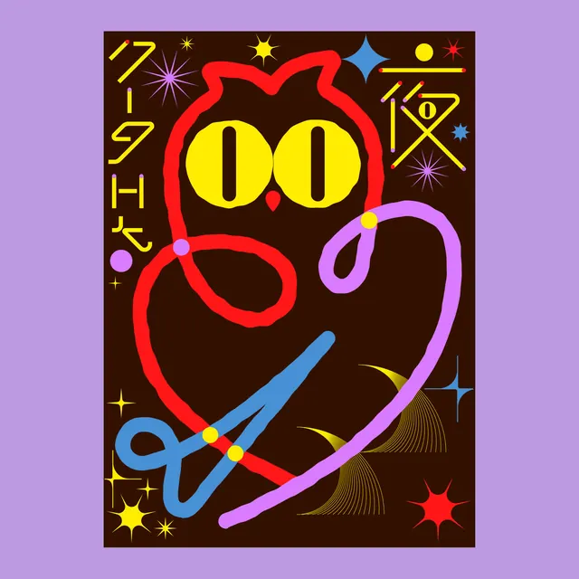
More like this

Keep what you find
A free account saves references to boards and can send you a weekly email of picks based on what you save.
To see every result, go Pro.