Preview image. Unlock full-res
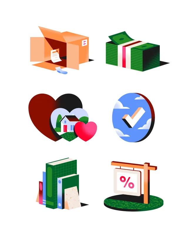
A set of playful 3D isometric illustrated icon spots for a financial management app, rendered in warm, saturated colors.

Summary
Six playful 3D isometric illustrated spots designed for Rocket Money, depicting financial and budgeting concepts through charming, simplified object renderings in warm, saturated colors.
Visual description
Six panels arranged in a three-by-two grid, each showing a single 3D isometric illustration on a plain white background. Icons include an open box with papers (documents), stacked green money (savings), overlapping hearts with a house (savings goals), a circular checkmark badge, books stacked with a receipt (expense tracking), and a wooden sign displaying a percentage symbol. All rendered in warm color palette: burnt orange, pink, forest green, and sky blue. Objects use consistent shading and perspective, appearing three-dimensional and tactile despite their cartoon simplicity. Minimal line work and clean forms emphasize clarity at small sizes.
Key takeaway
Illustrative icon design that humanizes financial tasks through warm, relatable object metaphors. The consistent 3D isometric rendering style creates a cohesive system that feels playful without being childish, making finance feel less intimidating. Strong color consistency aids quick recognition and brand alignment.
Reuse notes
Perfect for fintech applications targeting consumers who find money management stressful. The friendly, non-threatening visual approach works well in onboarding, empty states, and educational content. Translates effectively to app interface grids, marketing materials, and social media. Works best when space is available for the full isometric treatment; scaling down may lose legibility.
From this post: Spots for Rocket Money app icons
View post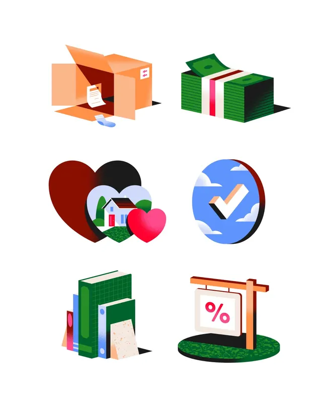
More like this


Keep what you find
A free account saves references to boards and can send you a weekly email of picks based on what you save.
To see every result, go Pro.