Preview image. Unlock full-res
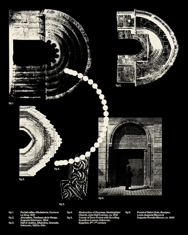
Four-slide carousel exploring the typographic and illustrative roots of the letter D (Dalet) in the western alphabet, presenting black-and-white visual studies of historical and conceptual forms.

Summary
A four-slide educational typography series exploring the visual and etymological roots of the letter D (Dalet), tracing the form from historical door imagery through geometric abstraction using architectural and textural references in high-contrast black and white.
Visual description
Black-and-white visual studies presenting the evolution of the letter D: slide 1 shows a refined sans-serif "D" with proportional annotations and construction lines overlaid, centered on neutral background; slide 2 presents a door image rendered in high contrast, establishing the etymological connection (Dalet meaning "door" in Hebrew); slide 3 displays geometric brick wall texture and architectural forms, exploring how the letterform relates to built environment and materiality; slide 4 returns to refined letterform display with similar measurement and construction clarity as slide 1, showing resolved understanding of form.
Key takeaway
The power of grounding letter design in historical and semantic meaning. The use of high contrast and minimal palette keeps focus sharp on form exploration. The documentary approach to alphabet history makes complex typographic concepts accessible and engaging.
Reuse notes
Valuable for educational content, design school presentations, and brand identity work emphasizing cultural or historical depth. The methodology of connecting form to meaning and etymology is replicable across entire alphabet projects. Works well for sophisticated audiences interested in design history and craft. Strong model for social media educational content and ongoing series formats.
From this post: Typography series "D for Dalet
View post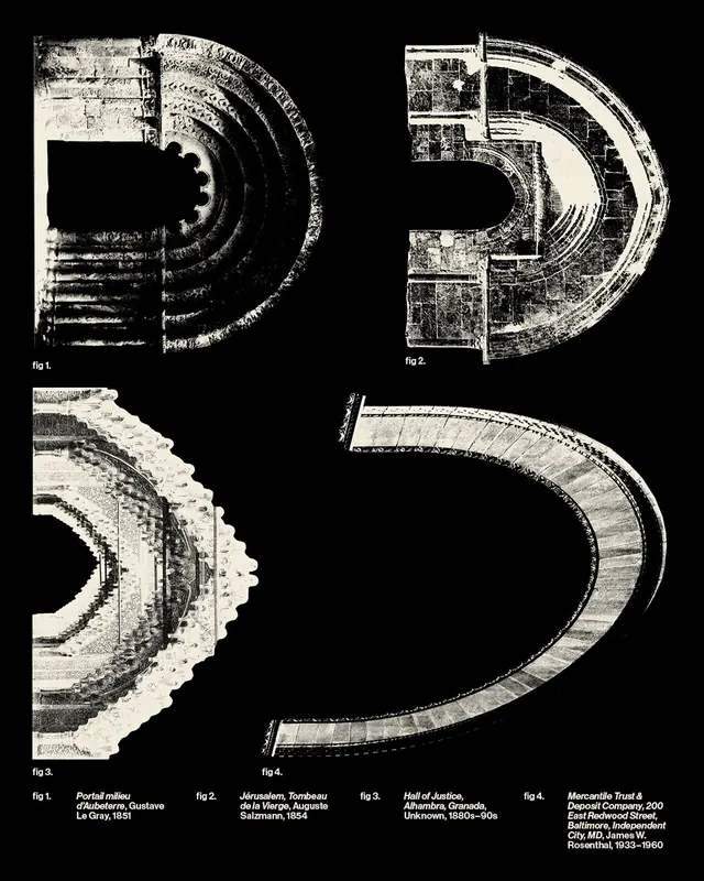
More like this
Keep what you find
A free account saves references to boards and can send you a weekly email of picks based on what you save.
To see every result, go Pro.