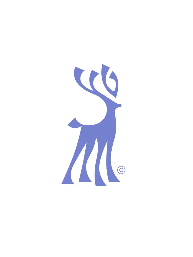
Preview image. Unlock full-res
A seven-slide design exploration of a geometric stag logo paired with a serif typeface, applied to culinary brand identity mockups.

Summary
A comprehensive brand design exploration featuring an elegant geometric stag logo, paired with the René typeface, and applied across culinary identity materials and marketing mockups.
Visual description
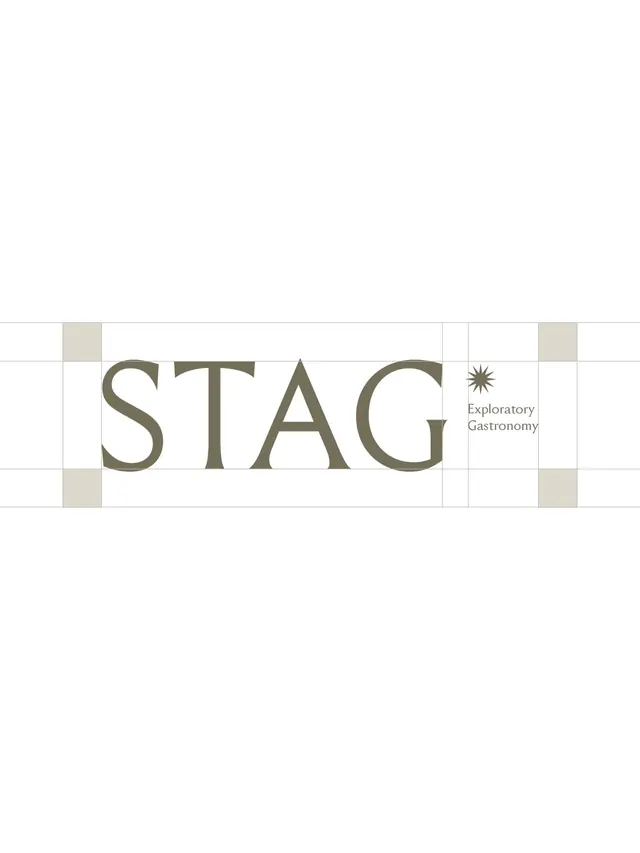
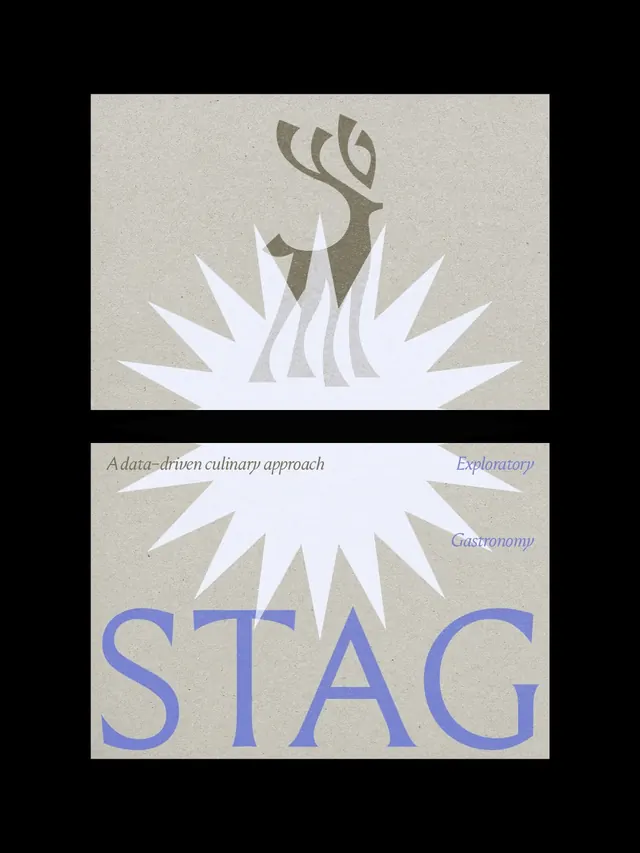
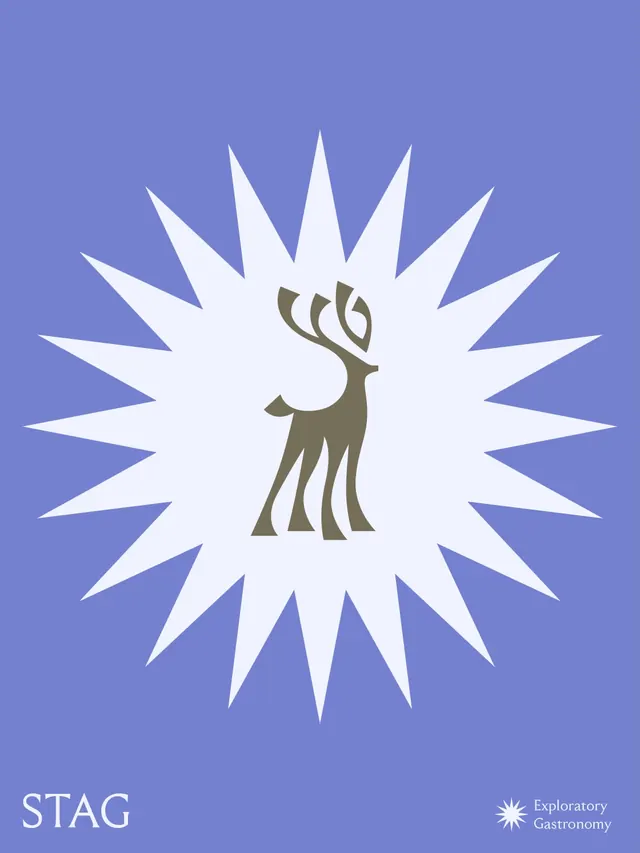
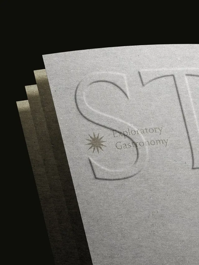
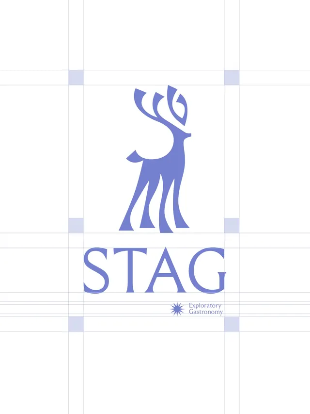
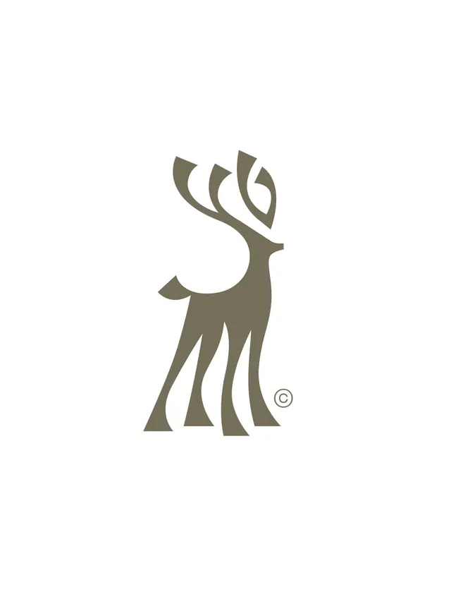
Slide 1 opens with the cover illustration. Slides 2-3 show the wordmark "STAG" with "Exploratory Gastronomy" tagline in gold serif type on a cream grid layout, emphasizing the negative space created by the antlers. Slides 4-6 present full-page mockups: posters, packaging, and collateral where the stag and typography anchor a sophisticated, earthy color palette of sage, cream, and deep tones. Slide 7 returns to the animal illustration. Throughout, the design uses a minimalist grid system and generous whitespace, letting the logo breathe.
Key takeaway
The geometric stag's negative space is the heart of the design, creating a visual anchor that works at any scale. The pairing with René serif type establishes a luxury culinary positioning. The progression from exploration to finished mockups shows design thinking and contextual application.
Reuse notes
Strong reference for upscale food/beverage branding, particularly when elegance and restraint are priorities. The animal silhouette combined with serif typography reads as premium and editorial. The grid-based layouts transfer well to menus, packaging, and event collateral. Works best in luxury or heritage food contexts; earthy palette may not suit tech or modern consumer brands.
From this post: Stag identity and culinary brand mockups
View post
More like this
Keep what you find
A free account saves references to boards and can send you a weekly email of picks based on what you save.
To see every result, go Pro.