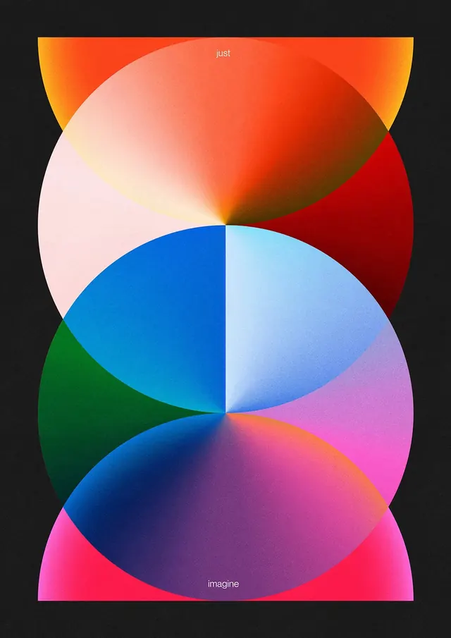
Preview image. Unlock full-res
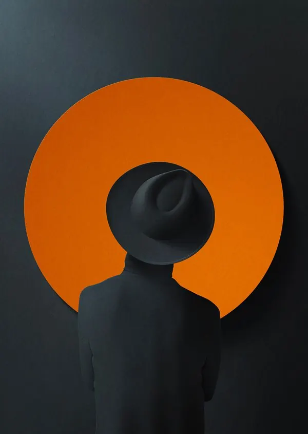
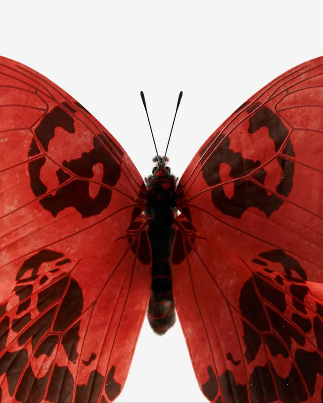
A vibrant illustration featuring coral red and navy blue tones in a portrait-oriented composition.
Summary
A digitally illustrated figure composition emphasizing warm and cool color contrast through coral reds and navy blues in a portrait format.
Visual description
Vibrant color palette dominated by coral-red and peachy tones (41%), balanced with cool navy blue accents (29%), and dark navy/almost-black shadows (25%). The composition appears to be a figure study or portrait with strong color blocking and painterly technique.
Key takeaway
The bold use of complementary color temperature contrast (warm coral against cool blue) creates visual tension and interest without relying on high saturation alone. The restraint in using just 4 colors makes the composition cohesive despite the intensity.
Reuse notes
Use as reference for color-blocked illustration work, portrait studies, or editorial artwork needing warmth-coolness contrast. Works well for magazine covers, editorial spreads, or gallery exhibition materials.
More like this


Keep what you find
A free account saves references to boards and can send you a weekly email of picks based on what you save.
To see every result, go Pro.