Preview image. Unlock full-res
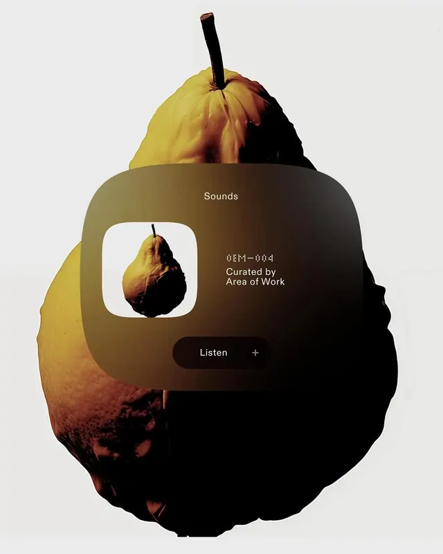
A conceptual music player interface built around the metaphor of a golden pear, featuring a rounded-rectangle frame with "Sounds" title and a listening prompt.

Summary
A digital music player interface centered around a golden-to-brown pear rendered in 3D, with a frosted glass overlay containing playlist metadata and a prominent "Listen" button.
Visual description
A 3D-rendered pear with warm gradient coloring (golden yellow transitioning to dark brown) sits at the top of the composition. Below it, a rounded rectangle with soft shadowing frames the interface: white sans-serif text reads "Sounds" and "OFI—064 Curated by Area of Work," with a small white rounded square containing a thumbnail of the same pear. A dark rounded button labeled "Listen" with a plus icon sits at the bottom. The overall palette is warm and muted with high contrast between text and background.
Key takeaway
Object-as-metaphor in interface design: using the pear as both visual anchor and logical connection (listening to something "organic" / "natural") creates narrative coherence. The 3D pear pulls users into a tactile, physical experience despite the digital medium.
Reuse notes
Excellent template for music apps, podcasts, or audio platforms seeking personality and delight. The pear metaphor works best for natural, organic, or wellness-adjacent content. Avoid for aggressive or energetic music styles; the gentle fruit aesthetic suggests calm or contemplative listening.
More like this




Keep what you find
A free account saves references to boards and can send you a weekly email of picks based on what you save.
To see every result, go Pro.