Preview image. Unlock full-res
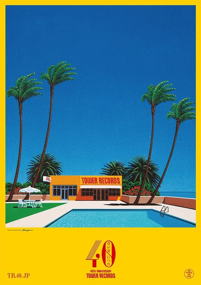
Flat retro travel-poster illustration of a Tower Records storefront beside a swimming pool with swaying palm trees under a solid blue sky, in a yellow border frame with 40th anniversary branding.
Summary
A mid-century retro travel-poster style illustration celebrating Tower Records' 40th anniversary, featuring a storefront beside a swimming pool framed by stylized palm trees and clear blue sky, rendered in flat colors with a bright yellow border.
Visual description
The composition centers on an orange-brown Tower Records storefront with bold red signage positioned beside a bright turquoise swimming pool. Stylized palm trees with bright green fronds sway on either side of the scene. A lounge chair sits poolside with a white umbrella. The sky is a solid, clear blue with no clouds. The entire scene is framed in a bright yellow border at top and bottom, with "40th Anniversary Tower Records" text and the number "40" prominently displayed below, along with Japanese characters (TR.40.JP) suggesting this was promotional material for the Japan market. Illustration style is flat, geometric, and highly stylized with clean line work.
Key takeaway
The effectiveness of retro aesthetic for nostalgia and celebration; how flat color palette and stylized forms can evoke a specific era; composition of product placement within lifestyle/leisure context to suggest aspiration and enjoyment.
Reuse notes
Excellent reference for retro branding, mid-century aesthetic campaigns, or anniversary commemorations. The travel-poster style works well for lifestyle and entertainment brands. The composition technique (product placed within a leisure scene) is effective for retail and consumer brands wishing to associate their store with experience and enjoyment. The flat-color illustration style is ideal for screen-based applications and print with consistent rendering.
More like this








Keep what you find
A free account saves references to boards and can send you a weekly email of picks based on what you save.
To see every result, go Pro.