Preview image. Unlock full-res
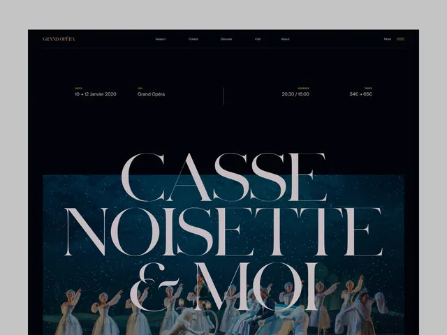
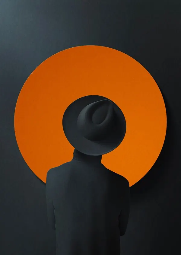
Dark, minimalist illustration of opera performance with monochrome palette and bold graphic forms.
Summary
An elegant illustration in dark tones with minimal color variation, rendering opera performance through bold graphic forms and high contrast between deep navy and light gray.
Visual description
Predominantly dark background with navy (#0A151F) dominating the composition. Light gray and beige tones (#C2C0C2) create the main subjects. Mid-tone gray accents (#677980) add subtle definition. The illustration uses clean lines and geometric shapes to render figures and scenery. High contrast between dark and light creates a sophisticated, dramatic effect typical of design studies.
Key takeaway
The restrained monochromatic palette with strategic use of highlights creates visual impact without relying on color variation. The clean, geometric approach to illustration demonstrates how minimalist techniques can convey complex theatrical subjects with elegance.
Reuse notes
Strong reference for illustration styles combining minimalism with thematic complexity. Works well for editorial design, poster concepts, or design system studies. The monochrome approach is ideal when versatile, scalable graphics are needed.
More like this


![['A', 'minimalist', 'illustration'], illustrated, minimal, dark](https://images.vasa.works/_t/illustration/qgU_gRQ.webp)
Keep what you find
A free account saves references to boards and can send you a weekly email of picks based on what you save.
To see every result, go Pro.