Preview image. Unlock full-res
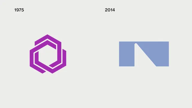
Two logo marks side by side on light gray, a magenta interlocking-hexagon symbol labeled 1975 and a solid blue N-shaped geometric mark labeled 2014.
Summary
A two-up logo comparison on a flat light-gray field: on the left a magenta hexagonal mark under a small "1975" label, on the right a solid periwinkle-blue mark under a "2014" label.
Visual description
The frame is split into two equal halves over a pale gray background. Each half holds one centered logo with a small black sans-serif year set at the top left of its zone. The 1975 mark is magenta and built from two offset, interlocking hexagon outlines that overlap to leave an open hexagonal counter in the middle, reading as a layered ring. The 2014 mark is a single solid periwinkle-blue shape, roughly a wide rectangle with a diagonal slice and a small notch cut from the top edge, so it resolves into a blocky, negative-space letter N. Both are flat single-color shapes with no gradients, shadows, or outlines, presented as a clean editorial side-by-side rather than a scene. Only the two year labels appear as text.
Key takeaway
The layout itself is the lesson: two dates, two marks, equal weight, nothing else, letting the viewer read an old-to-new brand shift at a glance. It also contrasts an intricate line-based emblem against a bold solid-shape mark as two eras of logo thinking.
Reuse notes
A tidy template for presenting a rebrand, a before-and-after, or any two-option comparison in a deck or case study. The flat neutral ground keeps focus on the marks. Swap in any pair of logos and dated labels; keep the two zones equal so neither reads as favored.
More like this





Keep what you find
A free account saves references to boards and can send you a weekly email of picks based on what you save.
To see every result, go Pro.