Preview image. Unlock full-res
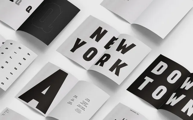
A flat-lay composition of printed pages and covers arranged in an isometric grid, showcasing typography and layouts.
Summary
A collection of publication pages and covers laid out in an isometric 3D perspective, displaying varied typographic treatments and page compositions.
Visual description
Multiple printed sheets arranged at dynamic isometric angles against a neutral background. Large bold sans-serif type reading "NEW YORK" on one central page, with other pages showing varied layouts including serif text, spacious negative space, and graphic elements. The pages are predominantly white and dark gray, creating strong contrast. Shadow and perspective lines emphasize the 3D arrangement. The compositions show both cover and interior spreads, each demonstrating distinct typographic or layout principles.
Key takeaway
Using isometric perspective and overlapping pages to showcase multiple design variations within a single composition. The technique demonstrates how different layouts can work as a cohesive system.
Reuse notes
Excellent for portfolio presentations, design system documentation, or publication marketing. The isometric angle works well in lookbooks and proposal mockups. Can be recreated with real printed materials or as a digital composition. The monochromatic treatment keeps focus on typography and layout rather than color.