Preview image. Unlock full-res
Two product-style mockups show a red face-like graphic applied to a square wall tile and a SIM-card-like card on contrasting warm and dark backgrounds.
Summary
Two product-style mockups show a red face-like graphic applied to a square wall tile and a SIM-card-like card on contrasting warm and dark backgrounds.
Visual description
The image is a side-by-side composition of two rendered product mockups. On the left, a cream square tile with rounded edges and a red face-like mark is mounted against a warm textured background; on the right, a white card with a SIM chip cutout and the same red graphic treatment sits on a dark maroon background.
Key takeaway
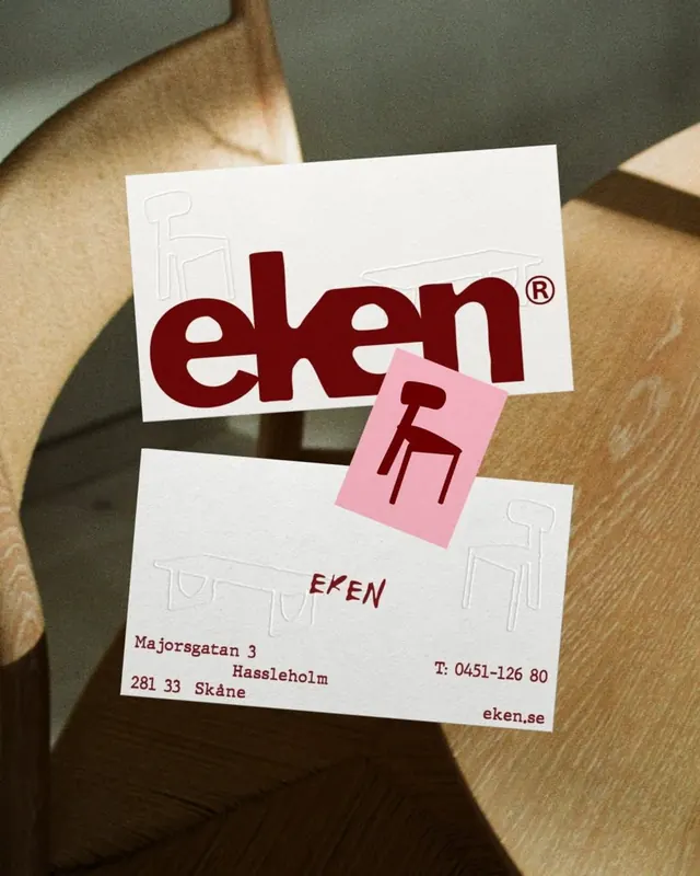
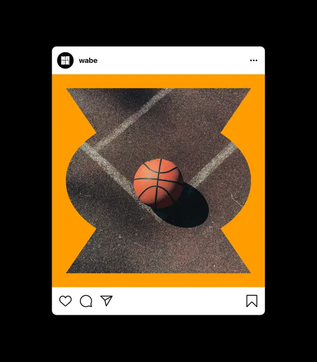
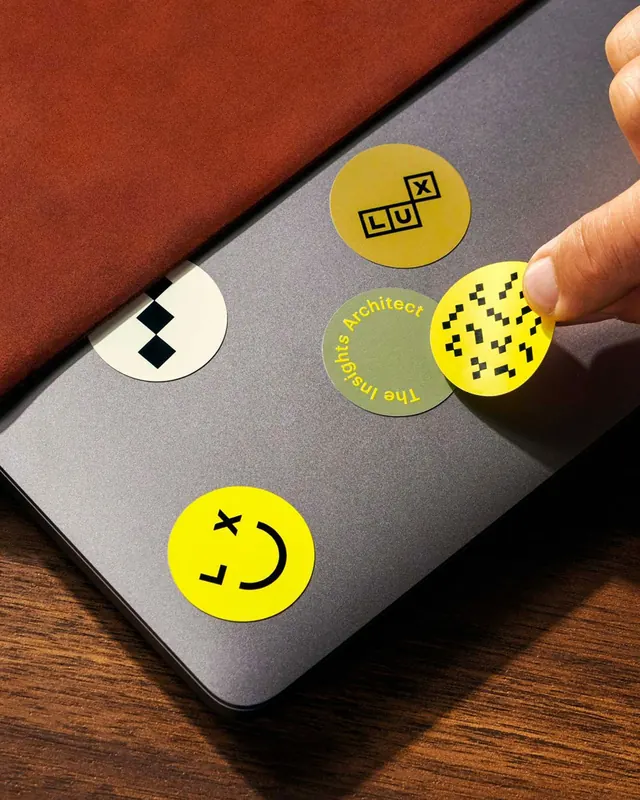
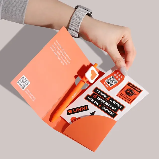
Use a simple recurring graphic motif across multiple physical mockups to create a cohesive identity feel. Strong color blocking against highly contrasting backgrounds makes the object read instantly.
Reuse notes
This approach works well for brand identity presentations, merch concepts, or packaging mockups where the same mark needs to feel adaptable across surfaces. It is especially effective when you want a playful symbol to feel premium through lighting, framing, and material contrast.