Preview image. Unlock full-res
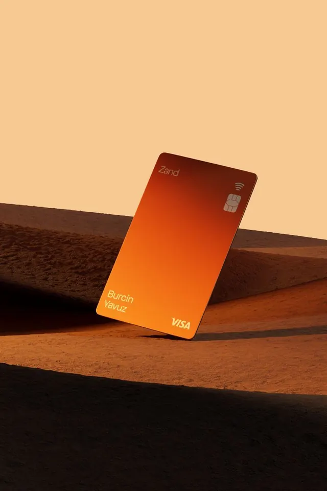
A tilted payment card with a warm orange gradient stands on a desert-like surface under a pale sky.
Summary
A tilted payment card with a warm orange gradient stands on a desert-like surface under a pale sky.
Visual description
A single bank card is photographed at an angle, leaning against a block-like desert form with strong shadows across the foreground. The card has a dark-to-orange gradient, a chip, a contactless icon, and small white text on its surface against a pale beige sky.
Key takeaway
Use a simple hero object with one strong gradient and dramatic natural lighting to make the product feel premium. Let negative space and hard shadows do most of the visual work.
Reuse notes
This works well for fintech branding, card launches, or any product that needs a high-end, minimal presentation. Reach for it when you want the object itself to be the focal point without added UI clutter.