Preview image. Unlock full-res
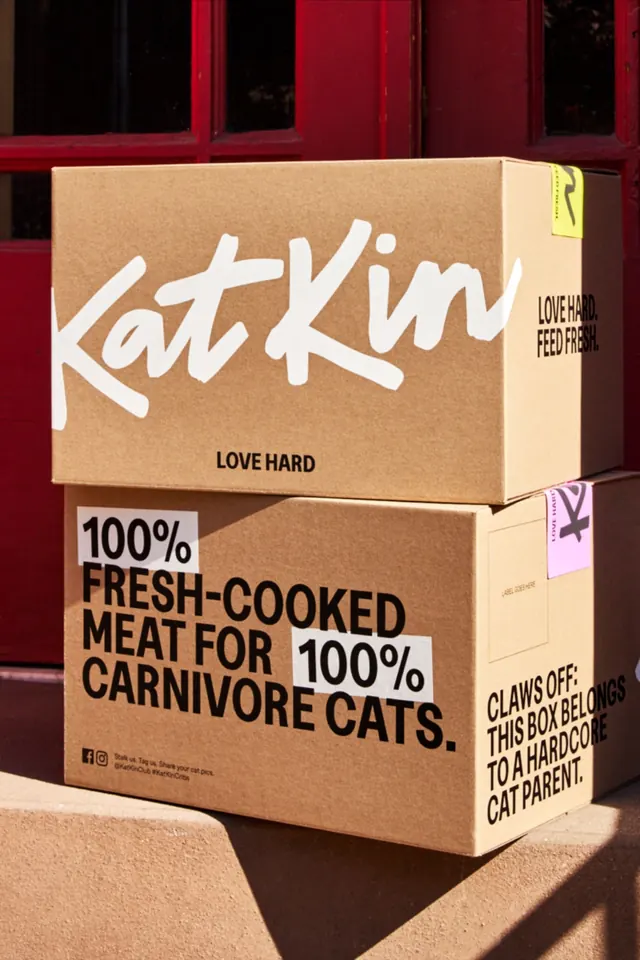
Two stacked cardboard shipping boxes are photographed in front of a red door, covered with bold cat-food branding and warning-style typography.
Summary
Two stacked cardboard shipping boxes are photographed in front of a red door, covered with bold cat-food branding and warning-style typography.
Visual description
A close-up photo shows two tan cardboard boxes stacked on a step in front of a deep red door. The top box has a large white handwritten-style wordmark across the front, while the lower box is covered with oversized black block text, white label blocks, and small sticker-like accents on the side and top.
Key takeaway
Use a plain shipping box as a high-contrast brand canvas, combining one expressive hero wordmark with secondary hard-edged utility text. The tension between casual handwritten branding and strict all-caps information gives the package strong shelf presence.
Reuse notes
Reach for this when you want packaging that feels direct, loud, and physically tactile rather than polished or luxury. It works well for food, pet, or DTC brands that want a streetwise, unapologetic tone.