Preview image. Unlock full-res
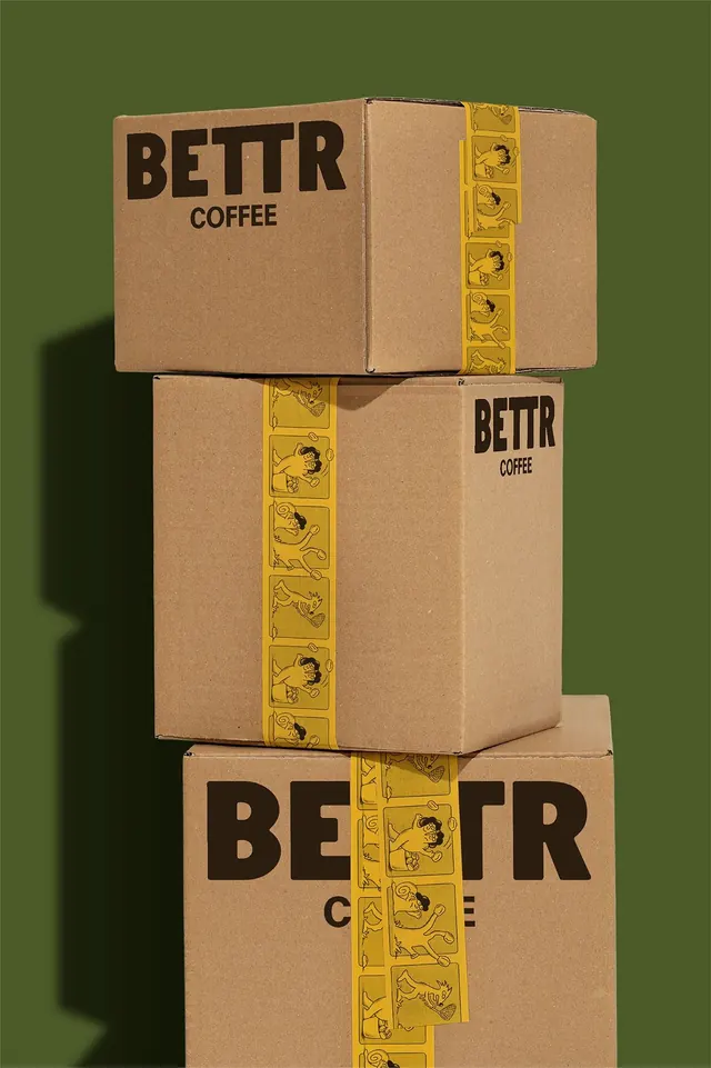
Three kraft cardboard coffee boxes are stacked against an olive-green background and wrapped with bright yellow illustrated tape and bold black BETTR COFFEE branding.
Summary
Three kraft cardboard coffee boxes are stacked against an olive-green background and wrapped with bright yellow illustrated tape and bold black BETTR COFFEE branding.
Visual description
The image shows three brown kraft cardboard boxes stacked vertically in a studio-style setup. Each box is wrapped with a vertical yellow tape strip printed with small cartoon illustrations, and the BETTR COFFEE wordmark appears in bold black on the box faces. The background is a flat olive green, with a soft shadow cast to the left.
Key takeaway
Use a restrained material palette and one high-contrast accent strip to make plain packaging feel branded and memorable. Large, heavy wordmarks paired with playful tape graphics create a strong identity even on simple shipping boxes.
Reuse notes
Reach for this when the goal is to make low-cost packaging feel designed without overprinting the box. It works well for coffee, DTC food, or subscription brands that want a tactile, direct-to-consumer look.