Preview image. Unlock full-res
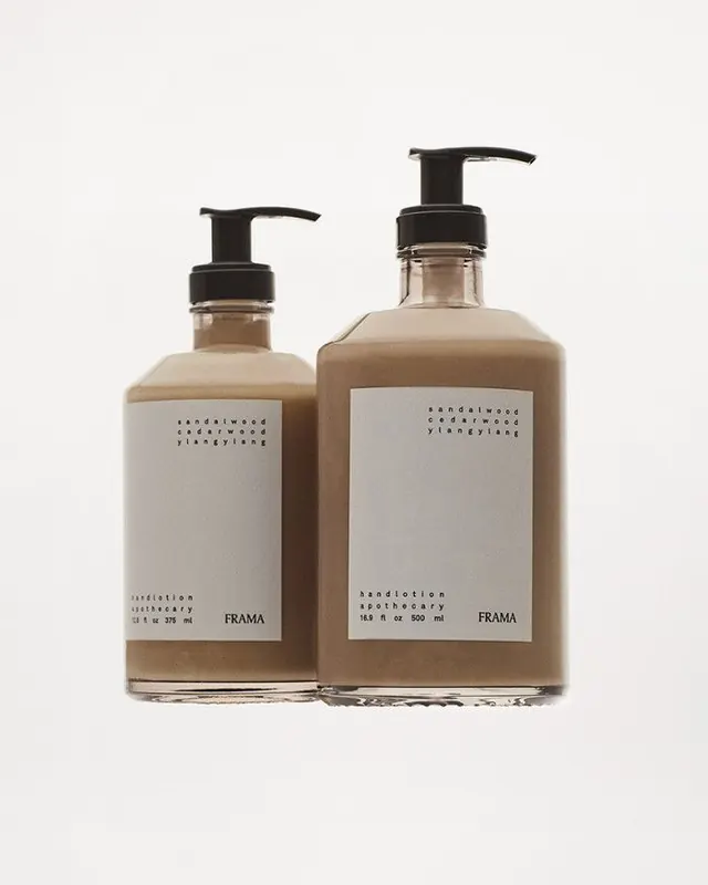
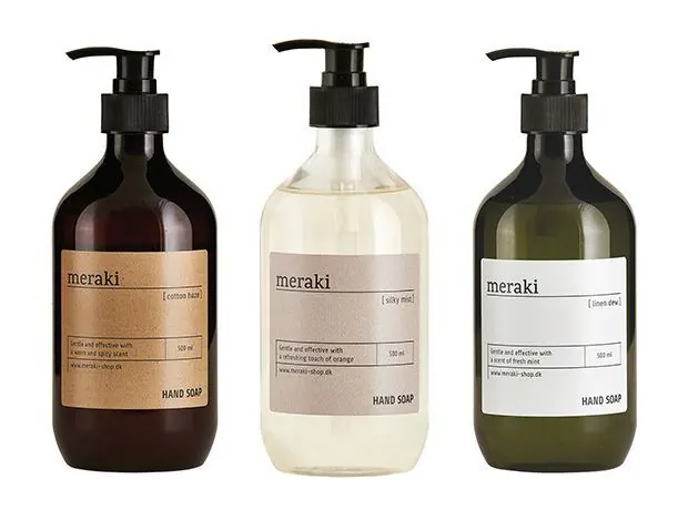
Three amber and clear pump bottles with minimalist label designs are arranged side by side on a white background.
Summary
Three amber and clear pump bottles with minimalist label designs are arranged side by side on a white background.
Visual description
Three pump soap bottles are shown against a plain white background, each with a rectangular paper label and black dispenser top. The left bottle is dark amber, the middle bottle is clear with a pale liquid, and the right bottle is dark green with a light label.
Key takeaway
Use a strict, minimal label system with lots of negative space and small typographic hierarchy. Keeping the bottle shapes consistent while varying only the liquid color and label tone creates a calm family set.
Reuse notes
Reach for this when designing a line of household or personal-care packaging that needs to feel clean and upscale. It works best for products sold in sets, where subtle color variation distinguishes scents or variants without breaking brand unity.