Preview image. Unlock full-res
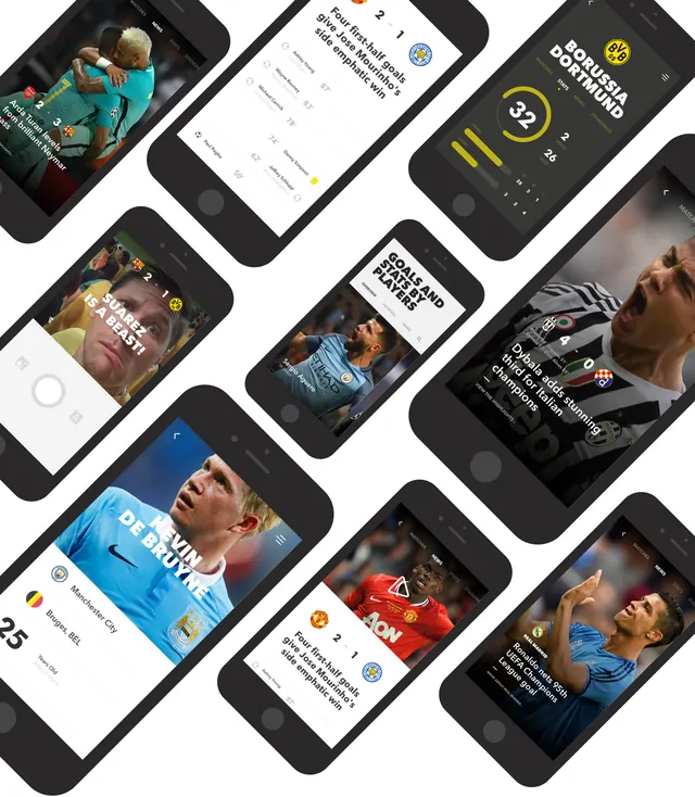
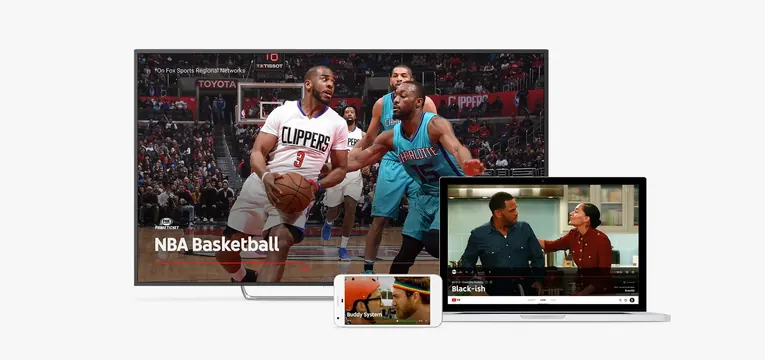
Layered product mockup showing YouTube interface designs across multiple screen sizes, from large TV to mobile, with sports content.
Summary
A product design mockup composition presenting YouTube interface explorations across multiple device formats—from a large TV screen down to mobile—displaying sports content and interface variations.
Visual description
Three layered screens, positioned at overlapping angles: a large flat-screen TV showing NBA basketball content with the label "NBA Basketball"; a smaller black rectangular screen above showing an interview or conversation scene labeled "BlackGish"; and a mobile phone portrait mockup below showing sports-related interface content. All screens display interface elements and video content with a consistent dark aesthetic. The arrangement cascades diagonally, emphasizing the responsive design across contexts.
Key takeaway
Multi-device composition showing interface consistency and adaptation—how a single design system serves platforms of vastly different sizes while maintaining usability and branded identity.
Reuse notes
Effective for product design presentations, responsive design case studies, or tech company portfolios where demonstrating cross-platform thinking is essential. The sports content adds specificity but the layout principle applies to any content-heavy service.