Preview image. Unlock full-res
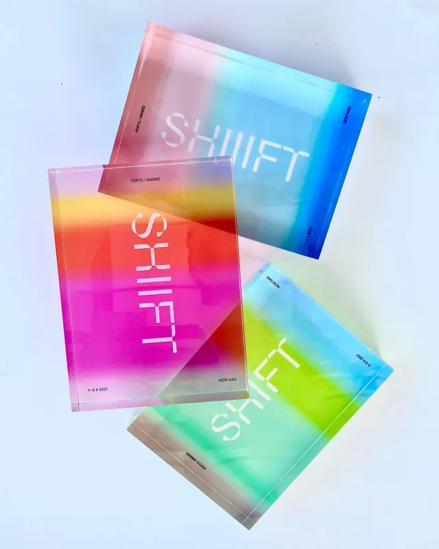
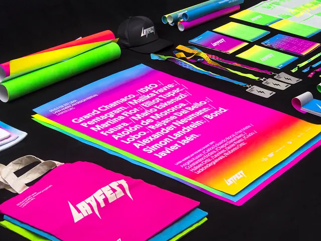
Vibrant neon gradient color palette applied to printed collateral and markers, showcasing a bold design system against dark background.
Summary
A brand identity system featuring vibrant neon gradients in lime green, hot pink, blue, and purple applied to marketing collateral, markers, and branded items on a dark background.
Visual description
A collection of printed materials and products displayed flat-lay style against dark charcoal. Vibrant gradient-filled cards transition through neon green, magenta, and blue hues with white typography. Fluorescent markers and branded cylindrical objects echo the neon palette. Each material shows bold sans-serif text and the dramatic color transitions create visual energy through saturation and hue contrast.
Key takeaway
The neon gradient palette itself becomes the visual star—applied consistently across different physical media (markers, cards, cylindrical forms) to create a cohesive, high-energy brand identity that would work for creative or tech-focused industries.
Reuse notes
Excellent reference for brands targeting younger or creative audiences who need bold, energetic color systems. The approach of applying gradients across physical products shows how digital color palettes translate to real-world applications.