Preview image. Unlock full-res
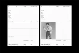
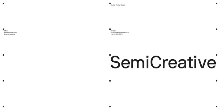
A minimal white presentation page shows the 'SemiCreative' wordmark with office and contact details, framed by small black registration-mark squares.
Summary
A minimal white presentation page for the brand "SemiCreative": a bold black wordmark fills most of the frame, alongside small office and contact text blocks and eight small black square registration marks at the page's corners and midpoints.
Visual description
The composition is a wide, letterboxed white page. Small black square markers sit at each corner and at the vertical midpoints of the left and right edges (eight total), most paired with a short line of black sans-serif text: top-right reads "Spatial Design Studio"; mid-left reads "Office / semicreative.co.nz / @semi_creative"; mid-right reads "Contact / studio@semicreative.co.nz / +64 22 322 0073." Below these blocks, a large bold black sans-serif wordmark "SemiCreative" spans nearly the full width of the right two-thirds of the page, left-aligned under the contact block. The rest of the page is empty white space.
Key takeaway
A brand's contact and office details are treated as compositional elements (small, evenly spaced text blocks pinned to registration marks) rather than footer copy, letting the oversized wordmark carry the page while the marks imply a print/spec-sheet origin.
Reuse notes
Works as a reference for a minimal, Swiss-influenced brand or portfolio cover page: one wordmark, sparse contact details, generous white space. The registration-mark grid is a distinctive detail specific to a print-style presentation; drop it for a purely digital-first layout.