Preview image. Unlock full-res
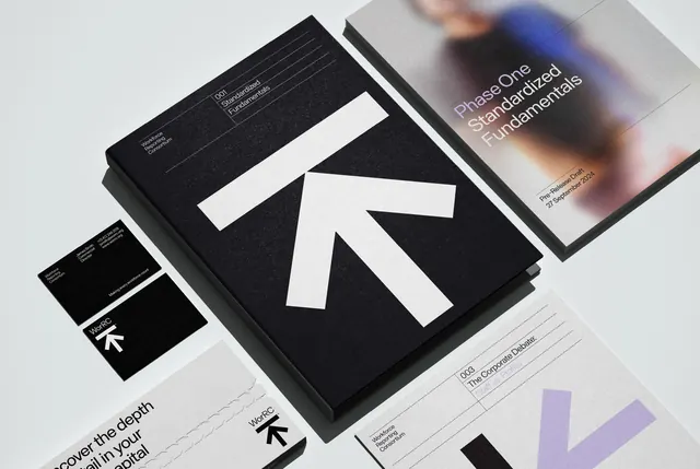
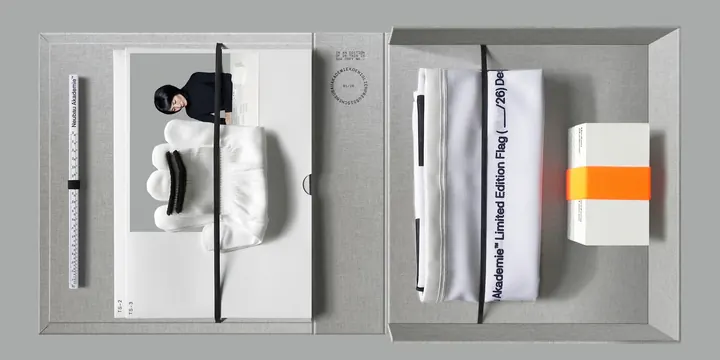
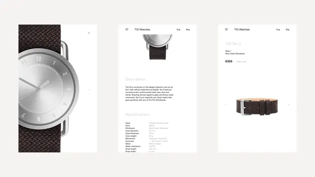
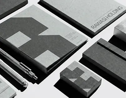
A comprehensive brand identity and visual system presentation showcasing typography, layout, and systematic design approach.
Summary
A polished brand identity system for a design practice, featuring clean typography, a well-organized grid layout, and a cohesive neutral color palette applied to a comprehensive visual framework.
Visual description
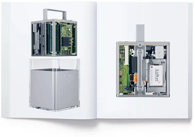
A large-format landscape composition displaying a design system or brand guidelines document. The layout uses a two-column grid structure with generous white space, neutral gray backgrounds, and black typography. Sections appear to showcase brand applications, layout patterns, typographic scales, and potentially color systems. The overall approach is minimalist and technical, emphasizing clarity and systematic organization. The palette stays within grays and blacks for maximum contrast and readability.
Key takeaway
The systematic approach to brand identity; the use of grid-based organization and restrictive color palette creates a professional, trustworthy appearance suitable for technical or enterprise contexts. The balance between information density and whitespace is exemplary.
Reuse notes
Strong reference for B2B SaaS, enterprise software, or technical product brand systems. The grid-based approach and minimal palette work well for industries requiring high credibility and clarity. Useful inspiration for design system documentation, brand guidelines templates, or professional service branding. The layout pattern could be adapted for marketing collateral, pitch decks, or service overviews.