Preview image. Unlock full-res
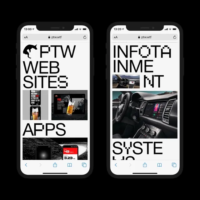
Two iPhones displayed side by side showing contrasting web layouts with bold type, images, and navigation patterns.

Summary
Side-by-side mobile mockups showing two distinct web design patterns: left screen displays "FTW WEB SITES" and "APPS" with product photography; right screen shows "INFOTA INMEMENT" and "SYSTE UP" with automotive imagery.
Visual description
Two iPhone 12-style frames displaying black-and-white web layouts. Left: bold oversized sans-serif headlines stacked, small product images below. Right: similar type treatment with different content arrangement and several car dashboard/interior photos. Both use white space, bold type, and photographic assets. Black status bars and navigation at bottom.
Key takeaway
The contrast between two content structures—stacked type-heavy vs. image-dense layouts—on identical hardware shows adaptable design systems for different content types.
Reuse notes
Useful for portfolios, agency case studies, or design system documentation where showing variation within a consistent framework is the goal.