Preview image. Unlock full-res
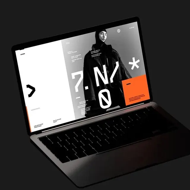
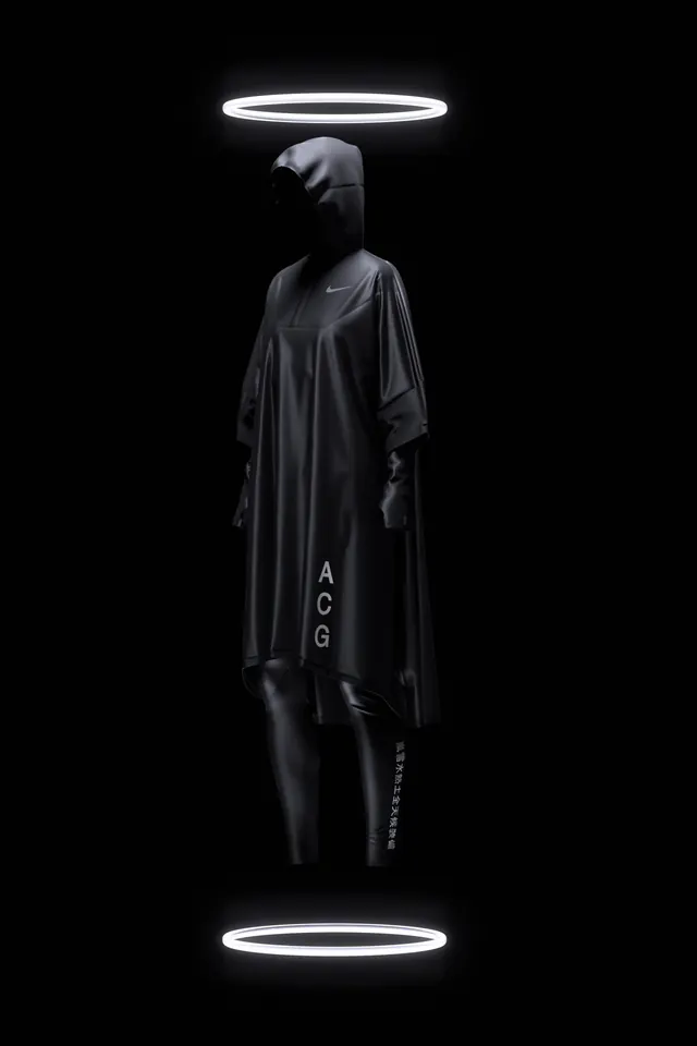
Vertical design composition for Nike ACG running concept, exploring dark monochromatic palette with typography focus.
Summary
A vertical design concept for Nike ACG, using stark black-and-white contrast and bold typography to convey athletic innovation and technical performance.
Visual description
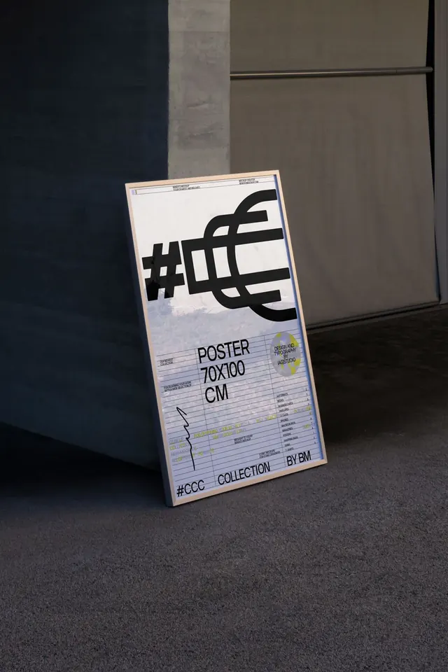
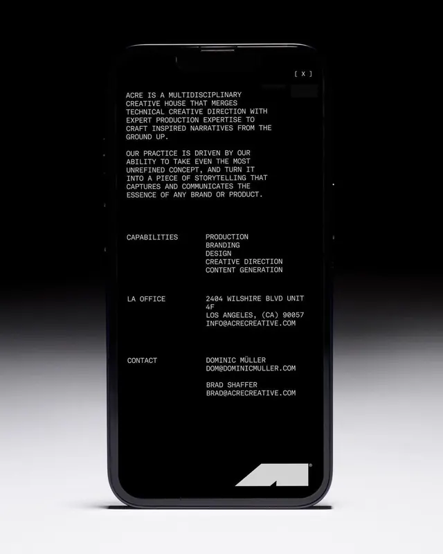
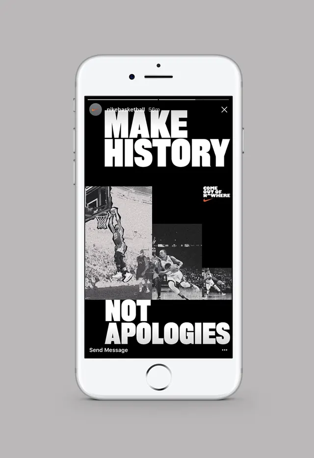
1280×1920 vertical composition. Nearly pure black background (#080808) with bright white/light gray typography and accents (#D5D5DB). Mid-tone grays (#515159) provide subtle depth and structure. The layout is dominated by typography—large, likely condensed or extended sans-serif. Minimal imagery; the design relies on type hierarchy and negative space. The vertical aspect ratio echoes product shots or poster formats. Clean, sharp edges throughout. High contrast creates visual intensity and energy.
Key takeaway
Black and white is not boring—it is forceful. Typography alone can carry a brand identity. The stark contrast reads as performance-focused and modern without relying on trendy color gradients.
Reuse notes
Excellent reference for athletic and streetwear brand identity. High-contrast B&W works particularly well in motion (video intros, transitions). The vertical format suits poster campaigns, billboard concepts, and mobile-first digital experiences. Good pairing with functional typefaces (trade gothics, geometric sans). Avoid softening with photography or illustrations—this strength lies in typographic boldness.