Preview image. Unlock full-res
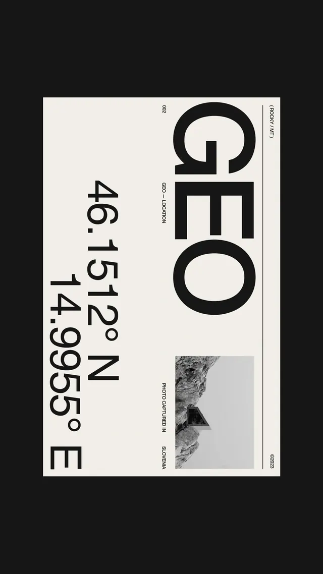
A side-by-side comparison of a minimalist editorial layout featuring a photograph of a modern architectural structure with a grid system.
Summary
A side-by-side comparison of a minimalist editorial layout featuring a photograph of a modern architectural structure with a grid system.
Visual description
The image shows two versions of a layout featuring a black and white photograph of a curved concrete building. The left version includes a fine grid overlay and small text labels, while the right version is a cleaner, more open composition.
Key takeaway
The design demonstrates how a rigid grid system can organize architectural imagery into a sophisticated, professional editorial format.
Reuse notes
This layout can be reused for architectural portfolios, design magazines, or high-end real estate brochures.
More like this
Keep what you find
A free account saves references to boards and can send you a weekly email of picks based on what you save.
To see every result, go Pro.