Preview image. Unlock full-res
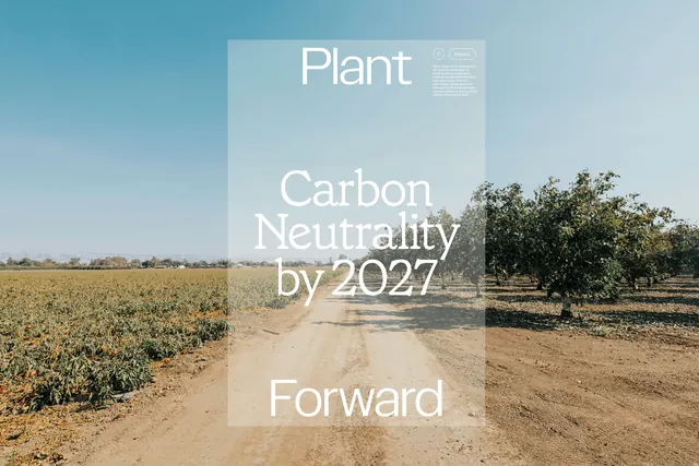
A clean, data-driven graphic comparing GHG emissions of wool production against a lower percentage.
Summary
A clean, data-driven graphic comparing GHG emissions of wool production against a lower percentage.
Visual description
A light beige background features a large central white box containing a percentage and text. A thin, white continuous line loop encircles the central content, with small text labels at the corners.
Key takeaway
Uses minimalist layout and oversized typography to emphasize a specific data point clearly.
Reuse notes
Apply this layout for other environmental impact statistics or comparative data points.
More like this
Keep what you find
A free account saves references to boards and can send you a weekly email of picks based on what you save.
To see every result, go Pro.