Preview image. Unlock full-res
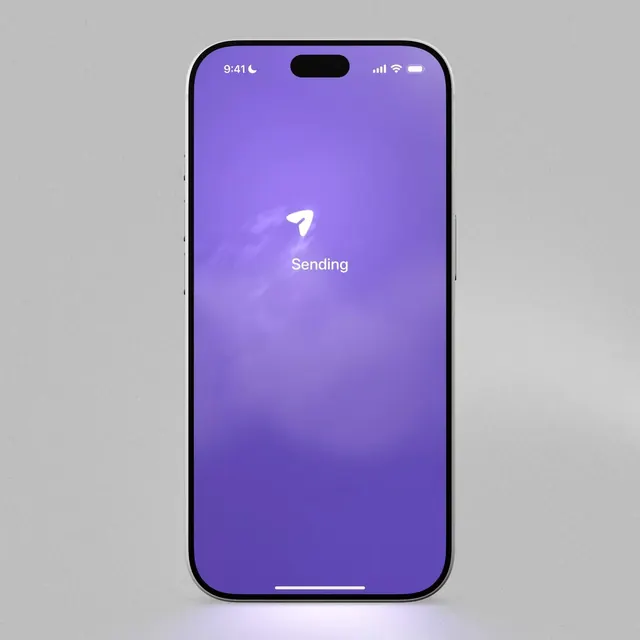
Two animated app states contrasting the hopeful purple sending screen with a dramatic stormy rejection screen, designed to humorously capture the App Store review experience.
More like this
See all
Summary
Two animated app states contrasting the hopeful purple sending screen with a dramatic stormy rejection screen, designed to humorously capture the App Store review experience.
Visual description
A single iPhone mockup stands centered on a flat grey, subtly grainy background, with a soft lavender glow pooling under its base. The screen is filled with a gradient of purple, lighter near the top and deeper violet at the bottom, with wispy cloud-like textures. A small white rounded arrow icon and the word "Sending" in white sans-serif are centered in the upper-middle of the screen, with the status bar and home indicator in standard iOS style.
Key takeaway
Fill the whole screen with one atmospheric color gradient and keep a single small icon plus one word of status text, so a transient state feels like a full moment rather than a spinner.
Reuse notes
Reach for this as a motion still reference. Pairs with soft ui directions. Original by Rob Swift.
More like this
Keep what you find
A free account saves references to boards and can send you a weekly email of picks based on what you save.
To see every result, go Pro.