
Preview image. Unlock full-res
A 14-slide carousel showcasing motion-based branding for Raycash, a privacy-first neobank, mixing geometric animation, typographic motion, and UI design with a bold color palette and contemporary feel.

Summary
A motion-driven brand identity for Raycash, a neobank built on cryptographic privacy architecture, designed to feel warm and accessible rather than technical. The carousel captures animated logo treatments, typographic motion, interface mockups, and dimensional geometric compositions that convey sovereignty, security, and everyday usability.
Visual description
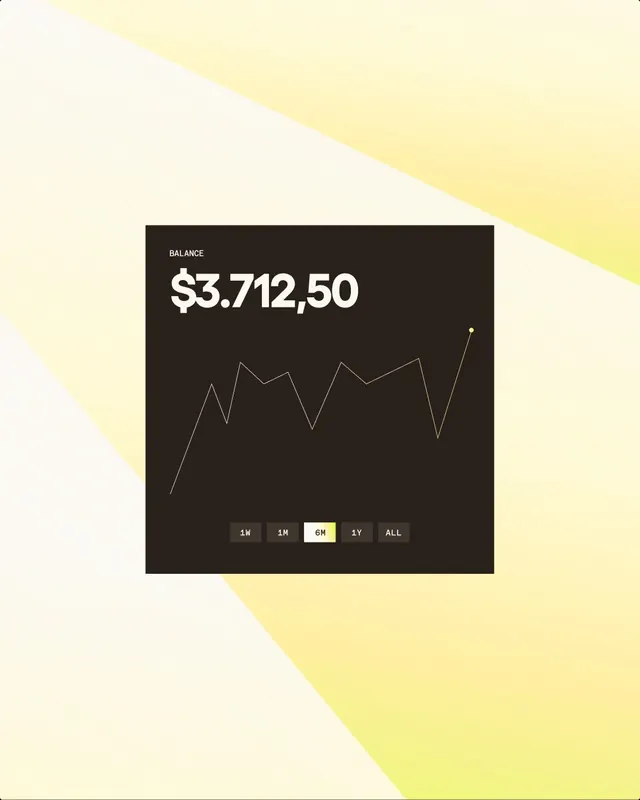
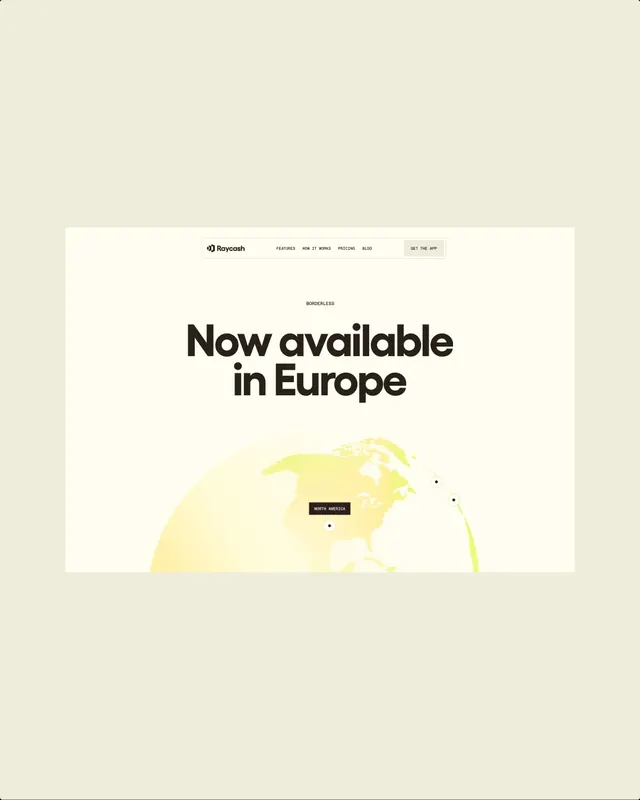
The carousel opens with an abstract geometric logo-layered black shapes on cream-then progresses through 11 video frames (still captures) showing motion sequences: animated letterforms building and reconfiguring, dimensional geometric forms rotating, a graph widget with balance and timeline controls set over a diagonal yellow/cream split, colorful exploded bar charts, and product interface mockups with cards, typography treatments, and iconography in bright color combinations. Later slides show map-like information design and layout studies. The color palette alternates between minimal cream/black/yellow and fuller spectrums with vibrant hues. Motion is evident in frame sequencing and composition progression.
Key takeaway
Motion and animation as the core of a fintech brand language-not decorative, but used to communicate trustworthiness and dynamism simultaneously. The pairing of cryptographic underpinnings with a warm, friendly aesthetic (avoiding the cold tech-speak of crypto). Geometric abstraction paired with real UI components to bridge brand and product.
Reuse notes
Reference for fintech, crypto, and blockchain-adjacent brands that need to balance technical sophistication with consumer accessibility. Use when designing motion systems for app onboarding, product animation, or kinetic brand guidelines. The strategy of moving geometry + solid UI components together is strong for app marketing and brand motion libraries. Works especially well for brands positioned at the intersection of innovation and everyday use.
From this post: Raycash fintech brand identity and motion design
View post
More like this

Keep what you find
A free account saves references to boards and can send you a weekly email of picks based on what you save.
To see every result, go Pro.