Preview image. Unlock full-res
A two-slide motion test: heavy stacked letterforms over a grainy peach gradient, then the word Goal across blue and grey panels with light streaks.
More like this
See all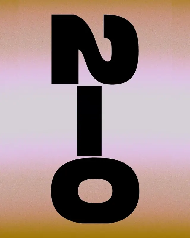

Summary
A two-slide motion test. The first frame stacks heavy black letterforms over a grainy peach-to-lilac gradient. The second sets the word "Goal" across two panels, one blue and one grey, with light streaks cutting through the letters.
Visual description
The cover and slide 1 are the same frame: a full-height portrait field that runs from warm peach at the top and bottom to pale lilac and grey in the middle, with a fine grain over the whole surface. Three oversized black letterforms are stacked and centred. The top glyph has an S-shaped stroke and reads as an N, the middle is a plain rectangular I, and the bottom is a wide, rounded O with a counter. Slide 2 is a black frame holding two rounded panels, one above the other. The top panel is saturated blue and the bottom panel is cool grey. Both carry the same heavy black word "Goal", set tight and slightly overlapping, with the final l as a tall bar. Thin streaks in pale yellow-green and muted pink run horizontally and diagonally across the letters in the blue panel, and as dim blue-grey tones in the grey panel. The two panels share one layout and differ only in colourway. These are video frames, taken from the poster stills of looping motion clips.
Key takeaway
A single typographic form shown in two colourways makes a clear palette study inside one carousel. The light streaks break across the heavy letters to add movement without changing the layout, and the grainy gradient shows how oversized type can carry a whole cover on its own.
Reuse notes
Reach for this when a motion or typographic brief needs a bold, text-led loop, or when you want to show one layout across two colour themes. It works better as a motion reference than as a static layout, because the streaks depend on animation and may disappear at feed size. The letterforms read clearly only in the stacked cover. The grain and gradient hold up as a still.
From this post: Stacked letterforms and Goal motion test
View postMore like this
Keep what you find
A free account saves references to boards and can send you a weekly email of picks based on what you save.
To see every result, go Pro.