Preview image. Unlock full-res
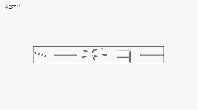
A minimalist typography study transforms Japanese characters into abstract line and block compositions on a clean white canvas.
Summary
A minimalist typography study transforms Japanese characters into abstract line and block compositions on a clean white canvas.
Visual description
A wide, thin rectangular outline contains stylized Japanese characters stretched horizontally to fill the frame. The composition is minimalist with a white background and thin black lines. Small sans-serif text reading Typography.16 and TOKYO is positioned in the top left corner.
Key takeaway
Stretching characters to fit the exact boundaries of a geometric container to create a structural, architectural feel.
Reuse notes
Reach for this as a motion still reference. Pairs with typographic, abstract directions. Original by 市川央.
More like this


Keep what you find
A free account saves references to boards and can send you a weekly email of picks based on what you save.
To see every result, go Pro.