Preview image. Unlock full-res
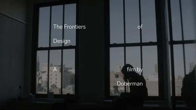
A dark film still or title card with a silhouetted figure against grid-pattern windows, overlaid with white sans-serif text reading "The Frontiers of Design: A film by Doberman.
Summary
A dark, minimalist film title card with a seated figure silhouetted against tall grid-patterned windows, using clean white typography to announce the documentary title and director.
Visual description
Dark gray/near-black interior space with tall windows behind. Multiple large window panes form a geometric grid, diffusing blue-gray daylight from outside. A single human figure is silhouetted in profile, seated or reclining, positioned on the right side of the frame. White geometric sans-serif typography is overlaid in a centered, left-aligned layout: "The Frontiers of Design" on the upper left, "A" on the middle left, and "film by Doberman" on the lower right. The text is sized in a clear hierarchy. The windows' grid lines and the interior architecture create compositional framing. The overall tone is contemplative and architectural.
Key takeaway
Typography as a compositional partner to photography: the text placement mirrors and echoes the window grid, creating visual harmony. Silence and negative space in a cinematic context, using light and shadow to convey mood rather than action.
Reuse notes
A reference for documentary, architecture, and design film marketing. The minimalist approach works for festival posters, digital trailers, and print materials. The grid pattern created by windows is naturally compositional and can frame subjects. The white sans-serif type is readable even in low-contrast environments. The overall aesthetic signals intellectual and design-forward content, appealing to creative and professional audiences.
More like this
Keep what you find
A free account saves references to boards and can send you a weekly email of picks based on what you save.
To see every result, go Pro.