Preview image. Unlock full-res
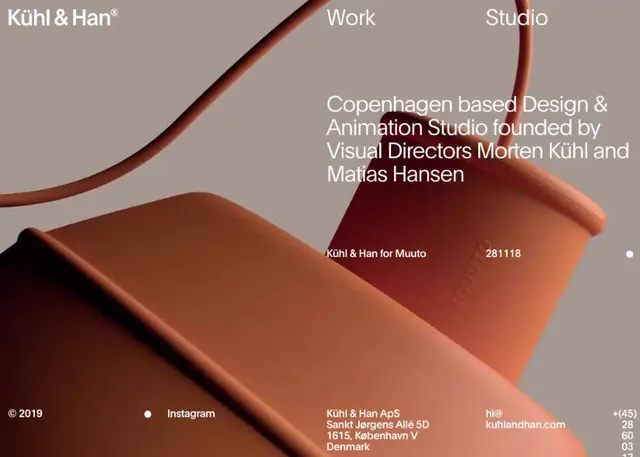
Motion graphics test frame with warm earth tones and subtle gradient, minimal form composition.
Summary
A motion design portfolio reel frame capturing a moment of subtle animation against warm, muted earth tones and soft gradients.
Visual description
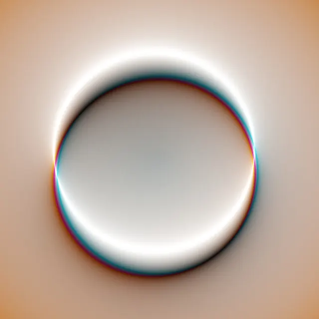
A wide rectangular frame (1600x1022) from a motion graphics reel. The composition uses a sophisticated warm palette: deep blue-grays (#293C45), warm beige/tan (#DED2BF), and muted teal-blue (#22638F). The image suggests minimal geometric forms or type treatment against gradient backgrounds—typical of contemporary motion design portfolios. The aspect ratio and quality suggest professional broadcast or streaming video.
Key takeaway
Sophisticated use of muted, warm color palette in motion design. The earth tones and subtle color shifts create professional, premium feel without relying on saturation.
Reuse notes
Perfect reference for motion design portfolios, creative agency branding, or digital experiences seeking warmth and subtlety. The earth-tone palette works well for upscale design firms, studios, or any brand seeking a contemporary yet approachable aesthetic. Good for understanding how motion design can feel professional without being cold.
More like this
Keep what you find
A free account saves references to boards and can send you a weekly email of picks based on what you save.
To see every result, go Pro.