Preview image. Unlock full-res
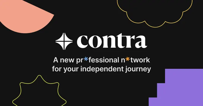
Dark centered card with the Contra serif wordmark and star mark, a two-line tagline, and playful colored doodle shapes scattered in the corners.
Summary
A dark, centered brand card: serif wordmark with a four-point star, a short sans tagline below, and a handful of bright outlined doodle shapes tucked into the corners for warmth.
Visual description
On a near-black field the logo sits centered: a white four-point star glyph beside "contra" in a high-contrast serif. Beneath it, a two-line tagline in light-grey sans reads "A new prfessional ntwork for your independent journey," where two letters are swapped for small colored asterisks (blue and orange). Scattered around the edges are playful shapes: a peach half-disc top-left, a yellow-outlined cloud top-right, a lime-outlined starburst bottom-left, and a violet stepped block bottom-right. The composition is symmetrical and calm at center, loose and decorative at the margins.
Key takeaway
Anchoring a clean centered logo lockup on dark, then sprinkling small bright outline doodles in the corners to add personality without crowding the message. Swapping a couple of letters for tiny colored asterisks injects brand voice into plain copy.
Reuse notes
Great for freelance platforms, communities, and consumer products that want friendly-but-premium. The corner doodles fill otherwise dead space on a wide OG ratio; keep them outlined and sparse so the center stays clean. Works specifically on dark.