Preview image. Unlock full-res
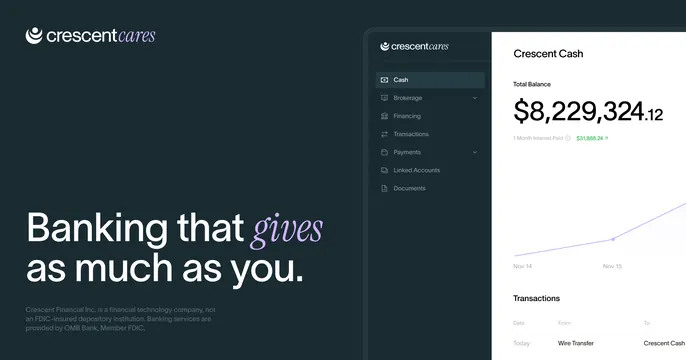
Dark fintech OG card with an oversized mixed serif-sans headline left and a light dashboard UI panel bleeding in from the right.
Summary
A polished dark fintech card with an oversized headline that mixes sans and italic serif on the left, and a clean banking dashboard sliding in from the right. The serif-italic accent word and the realistic UI do the work.
Visual description
Deep navy-black background on the left. Top-left holds the Crescent Cares logo (a crescent mark plus wordmark, "cares" in lighter weight) in white. Below, an oversized white headline "Banking that gives as much as you." where "gives" is set in a violet italic serif against the rest in upright sans. Small gray legal disclaimer text sits beneath. The right third shows a light-mode product dashboard partially cropped by the edge: a left nav (Cash, Brokerage, Financing, Transactions, Payments), a "Crescent Cash" panel with a large total balance of $8,229,324.12, a green interest figure, a line chart, and a transactions table.
Key takeaway
Dropping a single word into an italic serif inside an otherwise sans headline adds warmth and editorial polish for almost no effort. Letting a realistic light dashboard bleed off the right edge against a dark field creates instant contrast and credibility.
Reuse notes
Strong for fintech, banking, or any product whose dashboard is genuinely attractive. The dark-left, light-right split flatters a clean UI. Keep the disclaimer small; it adds legitimacy without competing. Works best when the headline carries one expressive accent word.