Preview image. Unlock full-res
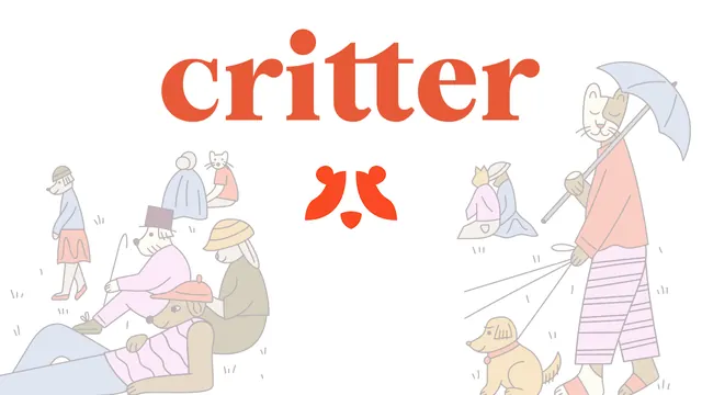
White OG card with an oversized red serif wordmark centered over loose hand-drawn pastel illustrations of people and pets.
Summary
A warm, illustration-led card built around an oversized red serif wordmark and a scattered scene of loosely hand-drawn people and pets. The sketchy art and big logotype carry the whole brand.
Visual description
White background. The word "critter" runs across the top center in an oversized rounded red serif, with a small red animal-face mark (two ears and a snout) centered just below it. Surrounding the lower half are loose, hand-drawn line illustrations colored in soft pastels: figures in beanies and hats sitting on the grass, dog and cat characters lounging, and on the right a tall cat-headed figure in a striped wrap holding a parasol while walking two small dogs on leashes. Short pencil-like grass strokes ground the figures. The style is intentionally rough and friendly, all thin outlines with flat pastel fills.
Key takeaway
Leading with an oversized expressive wordmark and surrounding it with a single illustrated world makes the brand itself the message, no headline needed. The hand-drawn linework signals warmth and personality that a polished vector never would.
Reuse notes
Best for a consumer or community brand where charm and identity matter more than a feature pitch. Works when you have a distinctive illustration style and a logotype strong enough to stand alone. Not suited to feature-heavy B2B messaging since there is no copy to explain the product.