Preview image. Unlock full-res
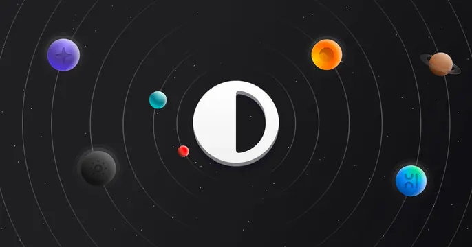
Dark space-themed card with a glossy half-filled D mark as a sun and colorful app-icon planets on faint orbit rings.
Summary
A space-diagram card that casts the brand mark as a sun at the center of a tiny solar system, with assorted glossy app-icon "planets" orbiting on faint rings.
Visual description
Dark charcoal background sprinkled with small white stars. Concentric thin grey orbit rings radiate from the center, where a glossy white rounded square holds a half-filled circle (a D-like mark, half white and half cut away) with a soft drop shadow. Riding the rings are small colorful 3D orbs that read as app icons: a purple sparkle tile (top left), an orange glossy sphere (top right), a brown ringed planet (right), a teal bead and a small red dot near the center, a dark perforated sphere (lower left), and a teal-blue icon with abstract marks (lower right). The composition mimics an astronomical diagram.
Key takeaway
Using an orbital-diagram metaphor to imply an ecosystem of integrations or tools around a central product, with each integration as a planet. The glossy 3D icons add depth and play against the flat starfield.
Reuse notes
Fits a platform, design tool, or hub that connects to many apps and wants to show breadth without a literal logo wall. The dark starfield keeps the bright orbs popping. Keep orbit rings subtle so the center mark stays the clear focal point.