Preview image. Unlock full-res
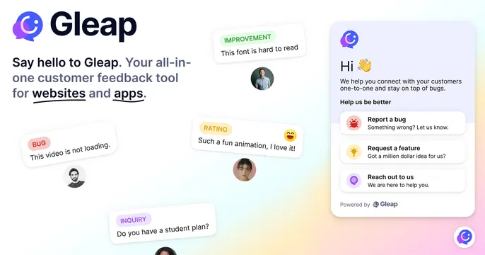
Light left-aligned OG card pairing a Gleap feedback-tool headline with floating feedback bubbles and a live in-app widget mockup on the right.
Summary
A clean white card with the Gleap logo and a feedback-tool headline on the left, scattered floating feedback message bubbles in the middle, and a realistic in-app support widget mockup pinned to the right. The defining move is staging real product chatter as floating cards around a live widget.
Visual description
White background with a soft rainbow-pastel glow bleeding in from the bottom right. Top left shows the gradient Gleap chat-bubble logo beside the "Gleap" wordmark in dark navy. Below, a dark headline reads "Say hello to Gleap. Your all-in-one customer feedback tool for websites and apps," with "websites" and "apps" underlined. Floating across the middle are labeled feedback pills (BUG, IMPROVEMENT, RATING, INQUIRY) each with a short user quote and a small circular avatar. The right edge holds a tall white widget panel: a "Hi" greeting with a waving emoji, intro copy, and three action rows (Report a bug, Request a feature, Reach out to us), footed by "Powered by Gleap."
Key takeaway
Using categorized, color-coded feedback bubbles with avatars to show the product's value (collecting varied feedback) instead of describing it. The functional widget mockup on the right grounds the playful bubbles in a real interface.
Reuse notes
Ideal for support, feedback, or bug-tracking SaaS that wants to feel friendly and human. Needs enough bubbles to feel lively but not so many they crowd the headline. The widget mockup should match the real product UI to stay credible.
More like this




Keep what you find
A free account saves references to boards and can send you a weekly email of picks based on what you save.
To see every result, go Pro.