Preview image. Unlock full-res
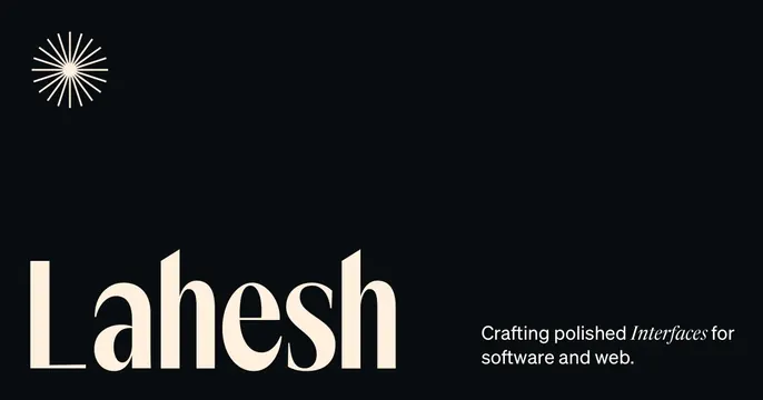
Dark elegant card with a large cream serif name, an italic-accented tagline, and a fine radial burst mark in the top-left.
Summary
A refined, dark personal-brand card for a UI designer: an oversized cream serif first name anchors the lower-left, balanced by a short italic-accented tagline and a delicate radial starburst mark up top.
Visual description
A deep near-black background. In the top-left corner a fine cream radial burst, many thin lines radiating from a center like a sun or sparkle, sits as a small logo mark. The lower-left is filled by the name "Lahesh" set very large in a high-contrast cream serif with elegant tapered strokes. To its right, baseline-aligned near the bottom, a two-line tagline reads "Crafting polished Interfaces for software and web." in a small sans, with the word "Interfaces" set in italic for emphasis. Vast empty black space separates the burst mark at top from the type at the bottom, giving the card a quiet, gallery feel.
Key takeaway
Pair an oversized contrast serif name with a tiny radial mark and generous black negative space for instant premium, editorial gravitas. Italicizing one keyword in an otherwise plain sans tagline adds a typographic accent at no extra cost.
Reuse notes
Strong default for a designer, studio, or boutique-service personal brand wanting understated luxury. The large serif needs to be a genuinely well-drawn typeface to carry the emptiness. Only works on dark; the cream-on-black contrast is the whole effect.
More like this


Keep what you find
A free account saves references to boards and can send you a weekly email of picks based on what you save.
To see every result, go Pro.